
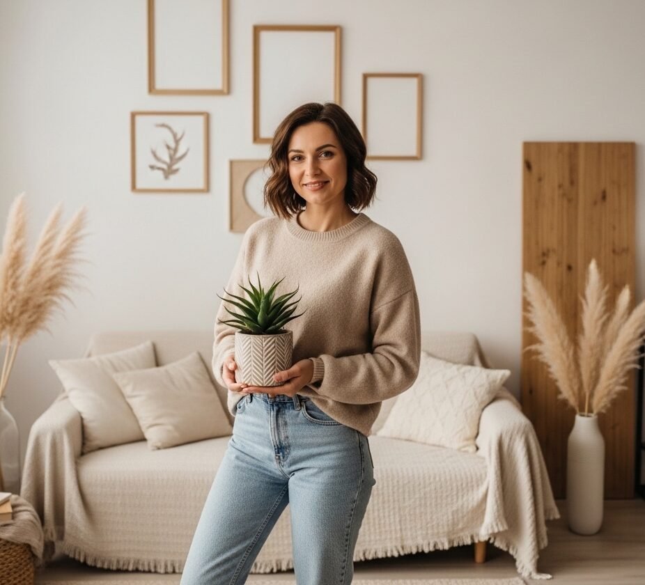
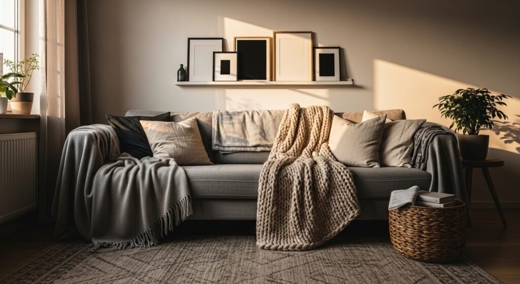
My living room looked like a hotel lobby for months. New couch, pretty rug, but no life. One night I draped a chunky knit throw across the arm, tossed a down-filled pillow on top, and suddenly it felt like someone actually lived there. That tiny edit taught me to look for texture and scale first, not furniture. The ideas below are the small moves that make a room stop being polite and start being used.
Scanner Match With Physical Chip Test For Paint-Forward Rooms

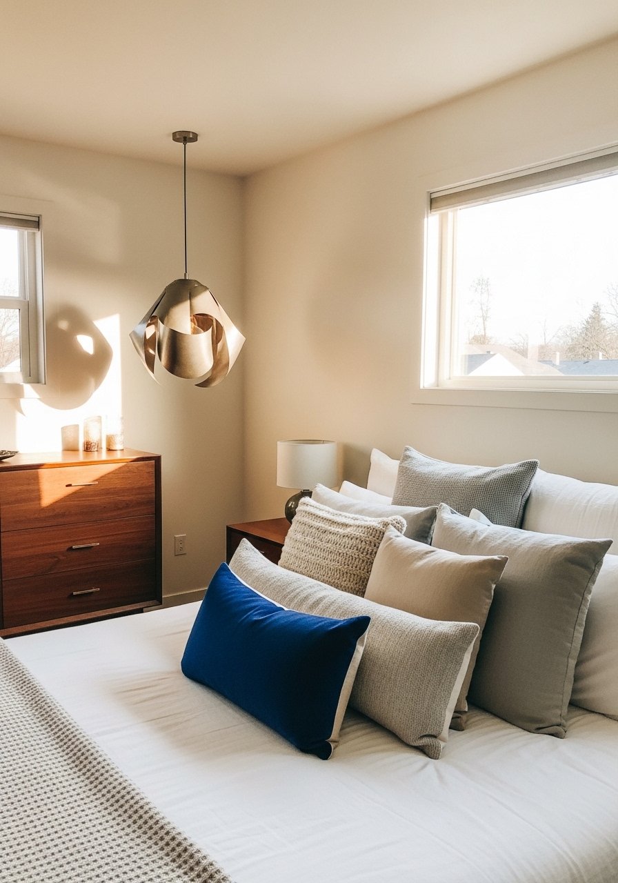
I learned to bring the actual paint chip, not the name or a picture. Hardware stores scan physical samples better than any color name. Paint a minimum 12×12 inch swatch on cardboard using small sample pots and stick them at eye level by the window and next to your lamp. Let them live there for 48 hours so you see the natural and artificial shift. Most folks blame lighting for 7 out of 10 bad matches, so this step saves huge headaches. If you want a portable scanner, grab a basic color-matching tool on Amazon like this handheld color reader to compare chips across rooms.
Lighting Layer Test Swatches For Any Room
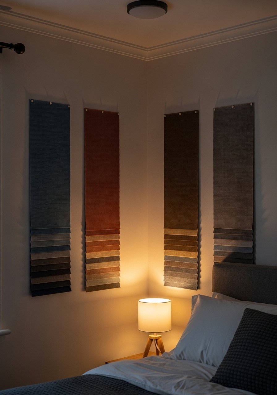
The trick is to test colors in every light the room uses. I painted three vertical tester strips on scrap foam board and moved them around the room for two days. Leave them during morning sun, afternoon shade, and under your warm bulbs. You will see undertones show up differently in each slot. A common mistake is picking a color under store fluorescents and assuming home light will behave the same. Try inexpensive sample pots and pick the one that reads best in your lamp light since that is when you actually hang out. For renter-friendly trials, peel-and-stick sample cards work well and you can buy packs like these removable paint sample sheets.
Finish Match For Trim And Walls In Modern Rooms

Finish changes how a color reads. I once matched the wall color perfectly but the trim looked slightly off because one was eggshell and the other was satin. Use an 80/20 rule for sheen distribution in a room, meaning mostly matte or eggshell with 20 percent semi-gloss for trim and accents. If you have high-touch areas, pick a scrubbable finish for durability. Ask the paint desk to mix your wall color in an eggshell base and the trim in semi-gloss. For a scrubbable option, try a recommended cabinet-friendly enamel sample like this low-sheen enamel tester. The mistake I see most is assuming sheen does not change perceived hue.
Custom Material Match To Fabric Or Tile For Boho Or Eclectic Spaces

When my sofa fabric had a green undertone, every gray I sampled clashed. Bring a fabric scrap or tile sample to the paint counter and ask them to scan it. Texture shifts light reflection, so the scanner data plus a 12×12 painted swatch in your room beats guessing. For non-flat surfaces like tile, consider a spectrophotometer rental if you need an exact match. For quick fixes, use this fabric-friendly color scanner to get you in the ballpark. A detail most people miss is that low-vocab names mean nothing; rely on the chip and a 48-hour room test.
Side-By-Side Brand Test Panels For Budget-Friendly Hacks

I love doing a competitive paint face-off when a big room needs a single color. Paint 2×2 foot panels of the pricier brand and a cheaper dupe, tack them up, and live with both for a few days. Four in ten people swap brands to save without losing quality, so this test helps you pick the best savings without ugly surprises. Pay attention to finish and pigment density. One brand might need an extra coat, which eats time. If you want the less expensive route, try these budget-friendly sample quarts like economy paint sample quart for quick panels.
Gloss Level Ratio Rule For Scandinavian Or Minimalist Rooms
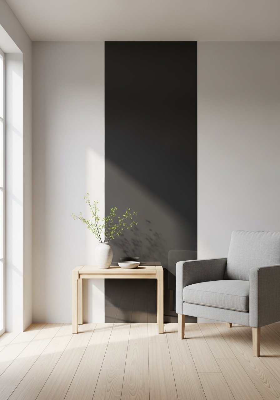
I switched one small wall from matte to satin to add depth and the room stopped feeling flat. Use a gloss ratio to plan finishes in a space. For most rooms, aim for 70 percent matte or eggshell and 30 percent satin or semi-gloss, concentrated on trim or one architectural feature. This keeps the room calm while adding subtle contrast. A mistake is applying glossy paint to large expanses and reading them as harsh. For testing, pick a small accent and paint a 12×12 area with a satin sample like this satin-finish sample pot before committing.
Spectrophotometer Rental For Accurate Matches On Tough Surfaces
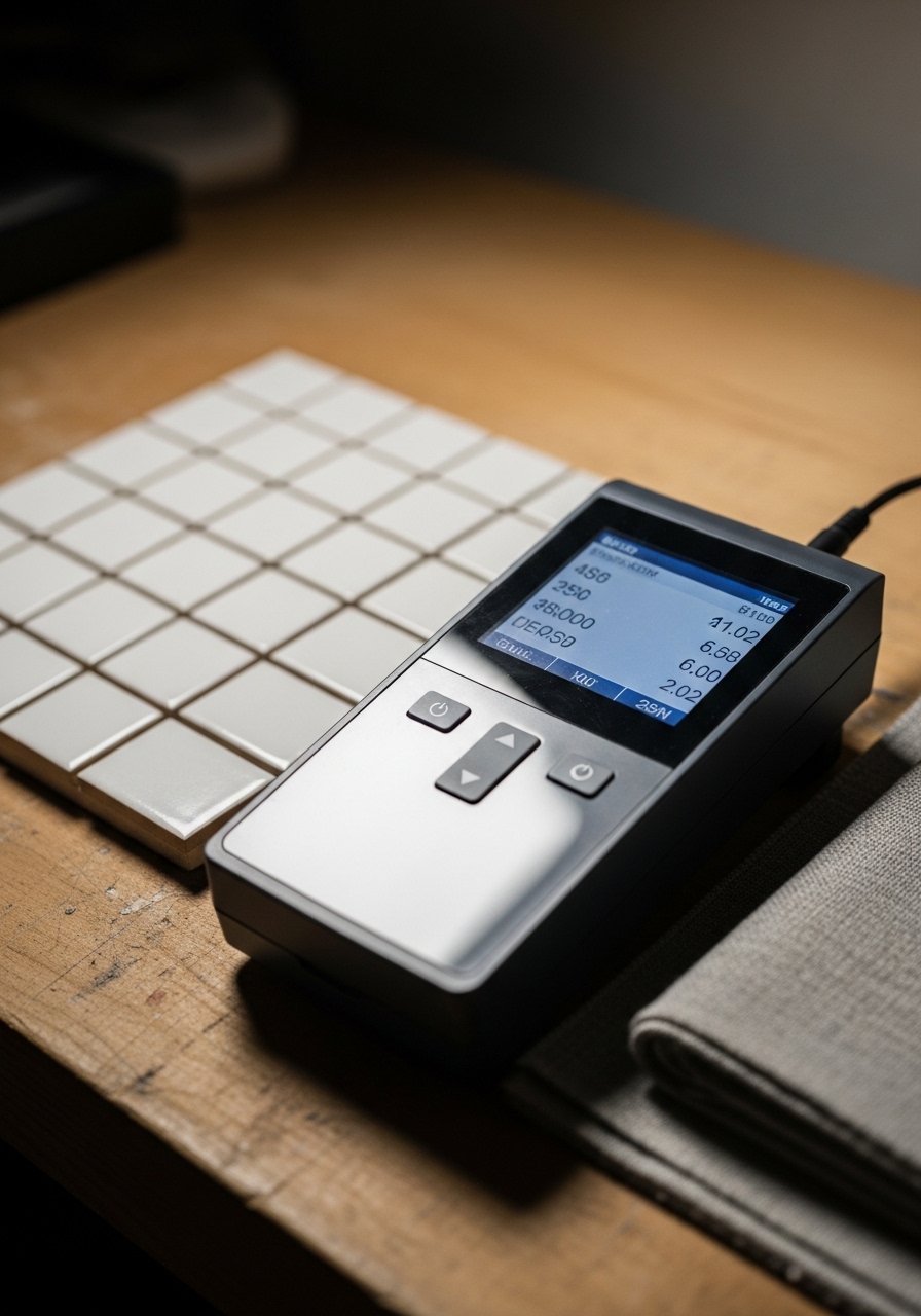
This is the nerdy move that saved me on a kitchen backsplash redo. Rent a spectrophotometer for a day when you need to match car paint, glazed tile, or weird vintage laminates. Scanners nail it 85% better than guessing, so the rental pays for itself if you avoid a repaint. Look for rental services at local lab suppliers or pro paint stores. Pair the numeric readout with three 12×12 swatches in your room and you will see how light and texture tweak the match. If rental is not an option, hire a pro for an hour or use a higher-end handheld reader like this portable spectrophotometer option.
Budget Sample Tier Mixing For Quick Visuals

If you do not want to spend for a full gallon, mix sample tiers. I blend a $3 sample with a $8 pro quart to create a gradient that shows undertones at three opacity levels. That trick reveals how the color behaves at thin and thick layers, which matters for open grain wood or textured plaster. Renter-friendly peel-and-stick swatches are great for testing scale without painting. Avoid the mistake of deciding from a postage-stamp chip. Make swatches at least 12×12 inches and look at them from across the room. For easy samples, try these small tester packs like paint-sample-testers-set.
Multi-Brand Durability Hack For High-Traffic Areas
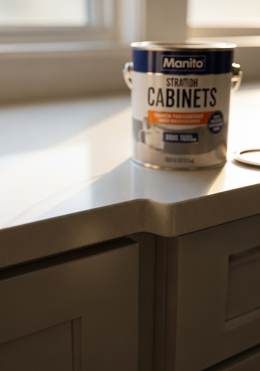
I wanted Benjamin Moore color with Sherwin-Williams durability for my mudroom cabinets. The trick is matching the hue with a scanner and ordering the tougher formula in that color family. Multi-brand swaps save you money and fix durability problems. One common error is matching color only and forgetting sheen and base differences. Tell the paint desk you need a scrubbable alkyd or enamel base and test a small cabinet door first. For touch-ups, keep a quart of the finished formula on hand. If you need a cabinet-ready sample, check this cabinet enamel sample for trial runs.
Your Decor Shopping List
- Honestly the best $40 I have spent. Chunky knit throw in cream (50×60 inches, acrylic-wool blend). Layer over sofa arms for instant texture
- For the curtain trick in idea 2, you need length. 96-inch linen curtain panels (set of 2, natural) for standard 9-foot ceilings
- Found these while looking for something else. Brass picture ledges (24 inches) to swap art without new nail holes
- Handheld color reader for scanning fabric or chips on the fly
- Removable paint sample sheets for renter-friendly swatching, pack of 12
- 6-foot faux fiddle leaf fig for height when you cannot keep a real plant, poly material
- Satin-finish sample pot for finish testing, 8 oz
- Paint-sample-testers-set with five small pots for gradient trials
Shopping Tips
- White oak beats dark wood in 2026. Design feeds have shifted. White oak floating shelves look current and wear well.
- Grab velvet pillow covers for $12 each. Swap them every season and the whole room feels refreshed.
- Curtains should puddle or kiss the floor, never hang halfway up. 96-inch linen curtain panels are right for 9-foot ceilings.
- One large plant beats five small succulents. If light is low, get an artificial fiddle leaf fig for presence without maintenance.
- If you have pets, pick washable fabrics and a scrubbable paint finish. Try a durable cabinet-enamel sample on a high-touch surface to test wear.
Frequently Asked Questions
Q: How long should I test paint swatches in the room?
A: Give swatches 48 hours in different lighting. Test them in morning sun, afternoon shade, and under your lamps. That routine catches undertones most people miss.
Q: Can I mix boho textiles with modern furniture without it looking messy?
A: Yes. Keep scale and color cohesion in mind. Use one dominant neutral fabric and add two patterned textiles in the same undertone range. I often use a neutral 22-inch linen pillow alongside a patterned 20-inch cotton pillow to balance texture and form.
Q: Is a spectrophotometer rental worth it for a DIY project?
A: If you are matching non-flat surfaces like glazed tile or car paint, it is worth renting for a day. Scanners nail it 85% better than guessing, and that saves repainting time and money.
Q: What is the right rug size for layered rugs?
A: Bigger than you think. Aim for an 8×10 under a standard living set so all front legs sit on the rug. For smaller spaces, leave 12 to 18 inches from rug edge to wall for proper framing.
Q: How do I avoid sheen clashes between walls and trim?
A: Use a consistent gloss plan. For most rooms, aim for about 70 percent eggshell or matte on the walls and 30 percent semi-gloss on trim. Test a 12×12-inch patch of each finish side by side to see the visual effect.
