


My living room had nice furniture and decent lighting but it still felt like a waiting room. Took me embarrassingly long to figure out it was missing height variation and bold color contrast. Once I added a patterned rug and a single chartreuse chair everything stopped blending into one flat plane and the room actually invited people to sit down.
These ideas lean art deco and playful-modern. Most pieces run from budget to mid-range, with a few splurges around $150. They work in living rooms, entryways, bedrooms, and small kitchens where a single colorful statement makes the whole space feel intentional. More than half go for scanner tools on tricky custom matches.
Bold Geometric Rug For Living Room Glam

The right rug anchors everything. I bought an 8×10 geometric rug and suddenly the sofa, lamp, and art felt connected. Geometric patterns read very art deco when you keep the palette to three colors, roughly 60/30/10 in dominance. A common mistake is buying a rug that is too small. Measure so the front legs of the sofa sit on the rug. I use a navy geometric rug for the base and layer a small 4×6 jute runner if the room needs warmth. Pro tip, try the rug in the room for two days before committing.
Jewel-Toned Velvet Sofa For A Cozy Sitting Area
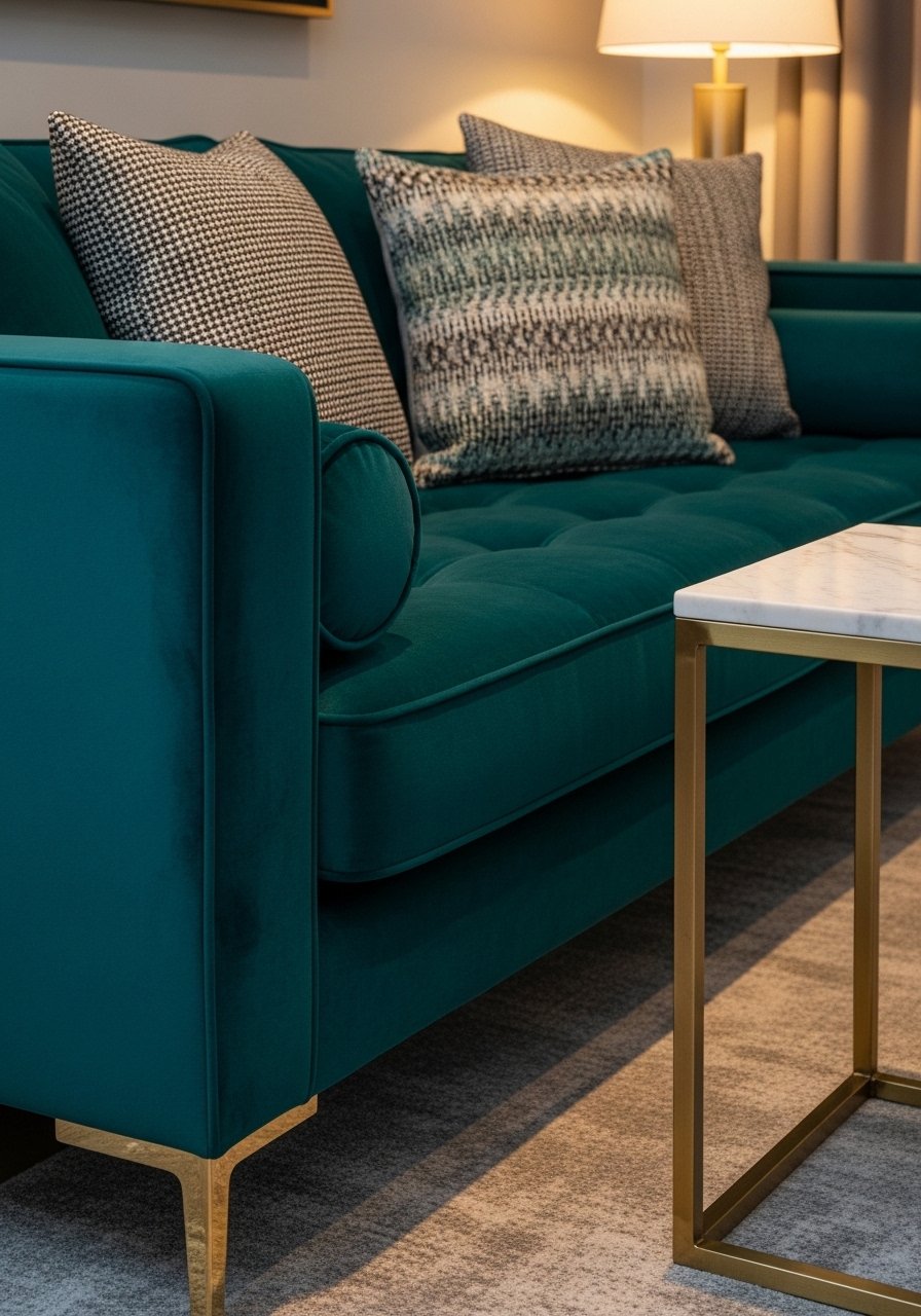
I replaced my neutral sofa with a deep teal velvet and the room stopped fading into the background. Velvet holds color well and reads richer than linen in lamp light. Expect to pay more, but you can get a statement look for under $900 if you hunt sales. The mistake I see is matching every textile to the sofa. Instead, use the sofa as the anchor and add linen or cotton pillows in 20-inch sizes to give contrast. Pair the sofa with a teal velvet sofa cover if you want the look on a budget. Lighting trips up color picks about 7 out of 10 times.
Mixed Metallic Lighting For Modern Glam Bedroom

Mixing metals keeps a space from looking overworked. I used a brass chandelier, matte black bedside lamp, and a gold sconce above the bed. The trick is balance, not matching. Pick one metal for the largest fixture and let smaller pieces pick up other finishes. People make the mistake of repeating the same metal everywhere. Instead, aim for 60 percent main metal, 30 percent secondary, and 10 percent accent. I grabbed a brass chandelier and swapped smaller fixtures later. It made the room feel layered and deliberate.
Sunburst Mirror Over Console In Entryway
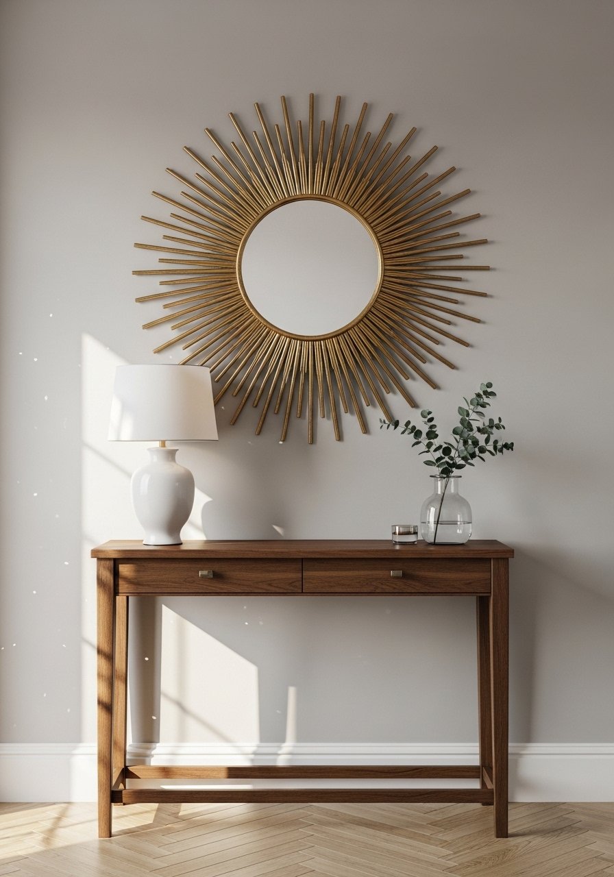
An art deco sunburst mirror is an old trick that still hits. I hung one above my console at eye level so the bottom edge sits about 6 inches above the table. That measurement prevents it from floating. A common error is hanging the mirror too high, which ruins flow. This instantly lifts a plain entryway and reflects light into the hall. For a budget find try a gold sunburst mirror. Pair it with the brass lighting idea above for a cohesive welcome.
Graphic Wallpaper Accent In Dining Nook

Wallpaper takes a room from flat to alive with very little fuss. I papered the short wall behind my dining table with a graphic art deco print and kept other walls neutral. The trick is using the wallpaper on one wall only if the pattern is large scale. People tend to paper an entire room and regret it. I like to calculate pattern scale by stepping back six feet and checking repeats. For renters use removable peel-and-stick panels. I used black-and-gold removable wallpaper so I could change my mind later.
Brass Bar Cart With Colored Glassware For Lounge
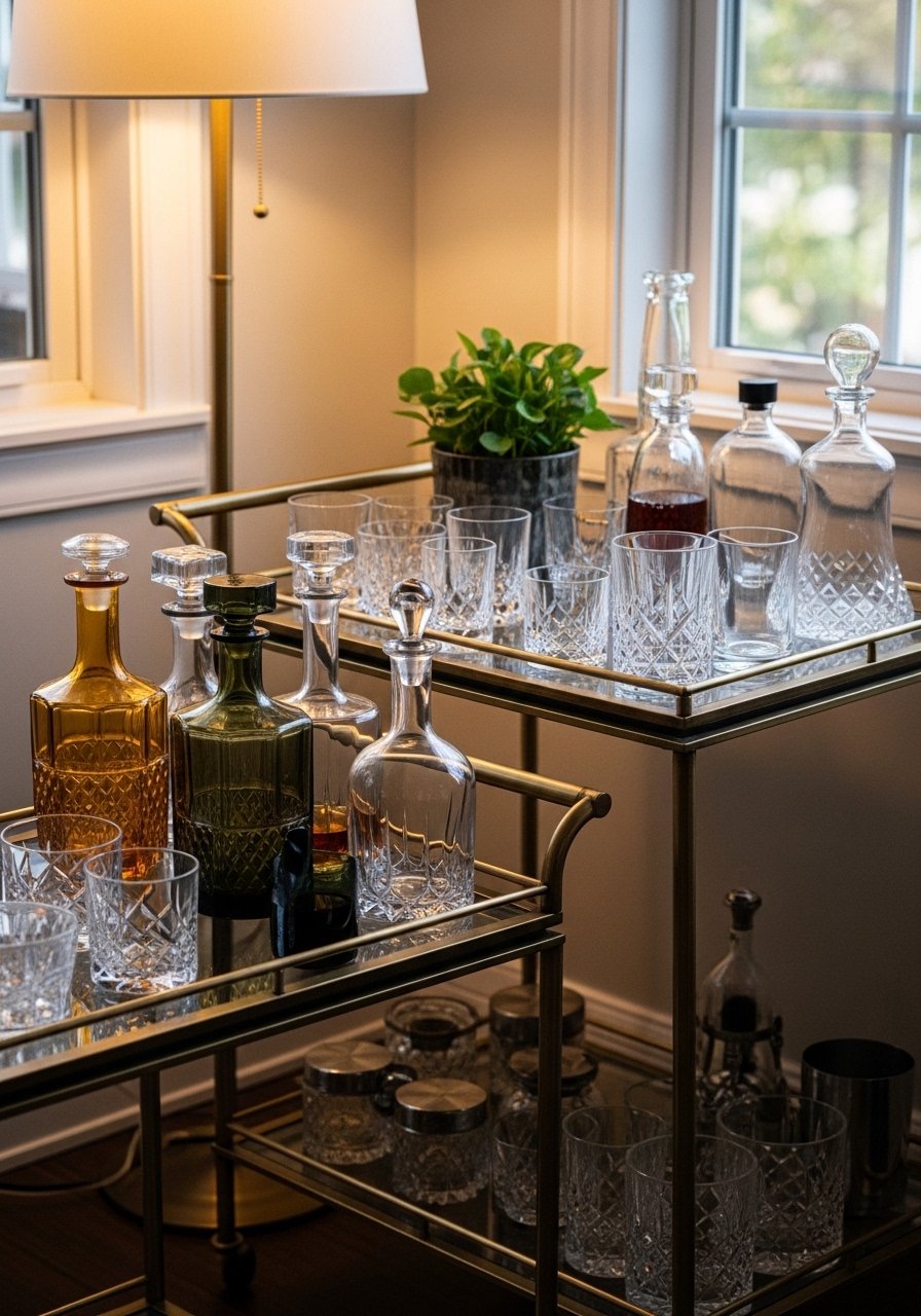
A bar cart adds color and a bit of showmanship. My brass cart holds emerald and amber glassware which ties back to the sofa and rug colors. The visual trick is grouping items in threes by height so the cart reads edited not cluttered. The mistake is filling every shelf with small items. Instead, leave negative space on the middle shelf. I recommend a compact brass bar cart and a set of colored tumblers for impact. Pair this with the sunburst mirror to bounce light off the glass.
Layered Pillows In Contrasting Patterns For Sofa

The moment I draped a chunky knit throw over the arm of my gray sofa, the whole room stopped looking flat. Pillows work the same way. Use a 60/30/10 mix of solids to patterns to accent colors. I stack a 22-inch down-filled linen pillow, a 20-inch velvet, and a 12×20 lumbar for depth. A frequent mistake is buying all small pillows which makes sofas look fussy. For easy swaps try 22-inch linen pillow covers. Mix textures so the palette pops without clashing.
Gloss Black Trim On Doors For Dramatic Hallway

Painting trim or doors in gloss black makes everything feel intentional and slightly theatrical. I painted my hallway doors gloss black and added brass knobs. It creates instant contrast against pale walls and ties vintage brass into the scheme. The trick is to scuff-sand and use a high-quality primer to avoid brush marks. People make the mistake of using the wrong sheen which shows every imperfection. If you want a renter-friendly option, try black adhesive film for a test run. I used high-gloss black paint on my trim for that polished finish.
Curved Accent Chair In Chartreuse For Reading Corner
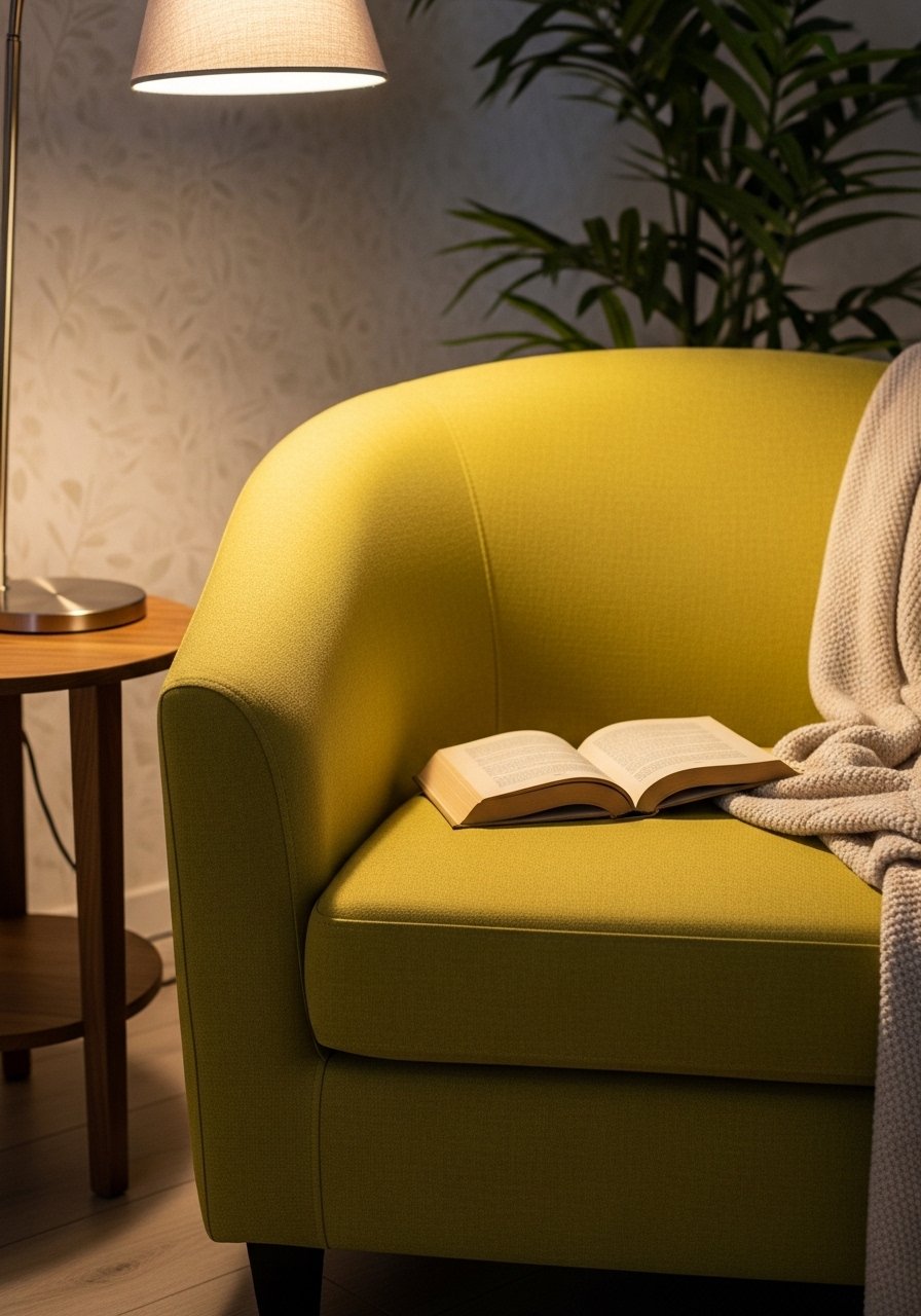
There is something about a reading nook with layered pillows that makes you want to cancel your plans. A curved chair in a bold color reads very art deco and fits small corners better than boxy silhouettes. I chose chartreuse because it pulls from the rug and the plant leaves. Common mistake is picking a chair that's too big. Measure the corner and allow 30 inches clearance for walking. I recommend a curved accent chair in a velvety fabric for tactile contrast. Pair with the layered pillows idea to tie the look together.
Glass And Gold Shelves Styling For Display Wall
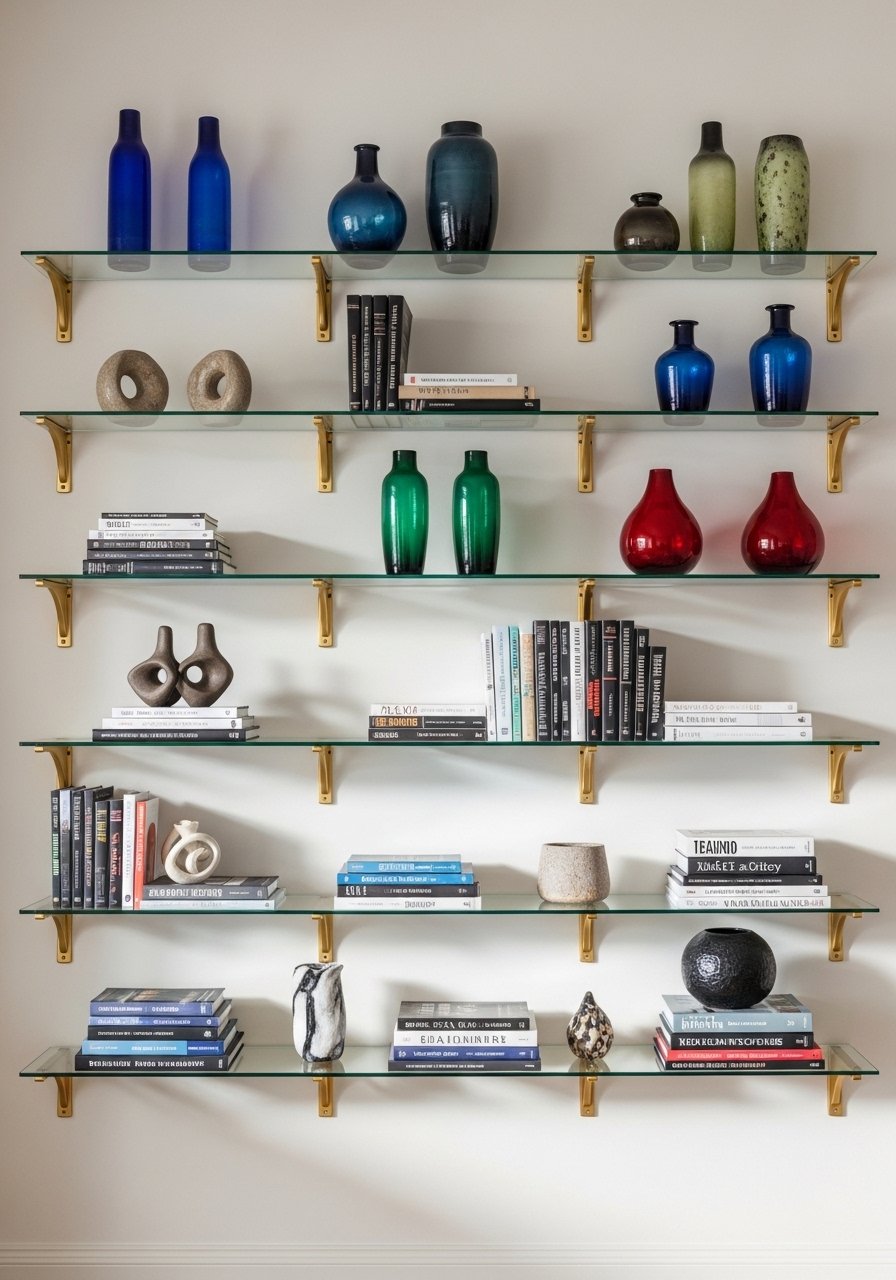
Open shelving shows your style in seconds. I used glass shelves with gold brackets so the hardware reads like jewelry instead of furniture. Keep shelf styling to three distinct groupings and repeat one color motif across shelves. A typical error is overcrowding every shelf. Instead, leave breathing room and rotate pieces by season. I put my taller objects on the bottom shelf, medium in the middle, and small on top for balance. For a quick install try gold floating shelves with glass.
Bold Artwork With Gold Leaf Frame For Focal Wall
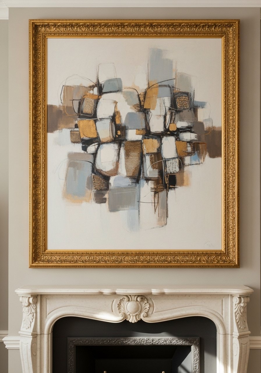
Big art makes small rooms feel curated. I picked an abstract piece with teal, mustard, and black and put it in a gold leaf frame to pick up other metallics. The rule I follow is the art should be at eye level, with the center about 57 inches from the floor. People often hang art too high above furniture. If you do not want to buy original work, pick a large print and upgrade the frame. I used a large abstract art print and framed it for the same effect at a fraction of the cost.
Marble And Colored Tile Backsplash In Powder Room

A small powder room is the best place to be bold. I added a band of colored art deco tiles behind the sink and kept the rest simple with marble-look porcelain. The precise detail I tracked was grout color. A mismatched grout can make tiles look cheap. Use a grout within two shades of the darkest tile color. Many people try full coverage and then regret it. A horizontal band at eye level often reads more intentional. For a DIY try art deco ceramic tiles.
High-Gloss Lacquer Cabinets In Deep Teal For Kitchen Pop

Painting lower cabinets in a high-gloss deep teal gave my kitchen the drama it needed without a full remodel. Gloss is reflective so it brightens small kitchens, but it also shows fingerprints so use it on lower cabinets or areas that get less grime. I saw the biggest change by pairing teal with brass pulls and a neutral countertop. The common mistake is using gloss on high-traffic cupboard doors. If you want the look without the upkeep, buy maple-effect adhesive panels. I used deep teal cabinet paint and swapped the hardware to brass.
Your Decor Shopping List
Textiles
- Honestly the best $40 I have spent, 22-inch linen pillow covers in ivory and slate for layered sofas
- Chunky knit throw in cream (~$35-55). Drape over the arm for instant warmth
Wall Decor
- Gold sunburst mirror 24-inch for entryways, similar finds at HomeGoods
- Large abstract art print 36×48 framed in gold leaf
Rugs & Flooring
- For the living room, navy geometric rug 8×10 anchors seating
- 4×6 jute runner for layering and warmth
Lighting & Hardware
- Brass chandelier modern (~$120-250)
- Mixed metal table lamp for bedside or console
Budget Finds
- Brass bar cart rolling (~$80-140)
- Black high-gloss paint quart for doors and trim
Shopping Tips
White oak beats dark wood in 2026. Design feeds have shifted completely. These white oak floating shelves look current, not dated.
Grab velvet pillow covers for $12 each. Swap them every season and the whole room feels different.
Curtains should puddle or kiss the floor, never hang halfway up. These 96-inch linen panels are right for standard 9-foot ceilings.
Everyone buys five small succulents. One single 6-foot fiddle leaf fig has ten times the visual impact.
If you are matching fabric to paint, bring a swatch to the store. Most matches get way closer when you scan the actual sample instead of pulling a formula.
Frequently Asked Questions
Q: Can I mix art deco patterns with modern furniture without it looking messy?
A: Yes. Keep the furniture simple and let patterns act as accents. Use the 60/30/10 rule for color dominance and limit pattern scale. If you follow the rug and pillow proportions in the article you will have a cohesive look.
Q: What size rug should I buy for a living room?
A: Bigger than you think. For a standard living room, go 8×10 minimum so the front legs of your main seating are on the rug. If you have a sectional, measure so at least 75 percent of the sectional sits on the rug.
Q: How do I match a fabric swatch to paint?
A: Bring the fabric to the paint counter and ask for a scan. Most matches get way closer when you scan the actual sample instead of pulling a formula. Test three swatches in the room at morning and evening light to avoid surprises.
Q: Should I use real plants or fake ones in art deco styling?
A: Both work. Real fiddle leaf figs and snake plants add life and texture. If you travel or lack sunlight, use a realistic faux fiddle leaf fig for height without maintenance.
Q: What finish should I use for trim and doors in a high-contrast hallway?
A: High gloss shows details and reflects light but picks up fingerprints. Use gloss for low-touch doors or lower cabinets. If you want the look without upkeep try high-quality adhesive panels or semi-gloss for a middle ground.
Q: How do I avoid color surprises after painting?
A: Lighting trips up color picks about 7 out of 10 times. Paint sample strips on foam core, hang them in the room, and view them at different times of day. If matching across materials, consider a scanner tool to get closer before you buy a gallon.
