

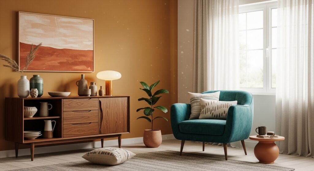
My living room had nice furniture and decent lighting but it still felt like a waiting room. Took me embarrassingly long to figure out it was missing texture. Every surface was smooth, every color was flat, and nothing invited you to actually sit down. Changing one wall color and adding a few textiles fixed that so fast I felt silly for waiting.
These ideas lean mid century modern with a warm, lived-in edge. Most suggestions are budget friendly with a few splurges listed. They work for living rooms, bedrooms, entryways, and small apartments where you want a sharper, more intentional feel.
Warm Ochre Living Room With Walnut Credenza
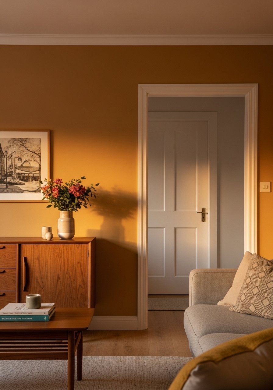
Warm ochre reads like real mid century, not beige from a catalog. Paint three walls this color and keep trim crisp white to highlight the architecture. It makes teak and walnut feel like part of the room instead of leftover furniture. Budget runs low to mid because paint and a small credenza are the main costs. I used an 80/20 rule in my own space, where the warm neutral covered most of the room and a single teal chair made up the rest. Common mistake is picking an ochre that leans too orange under evening light. Test a sample on two walls and check it across morning and evening before committing. Try pairing with walnut floating shelves for continuity.
Soft White Bedroom With Teal Accent Textiles
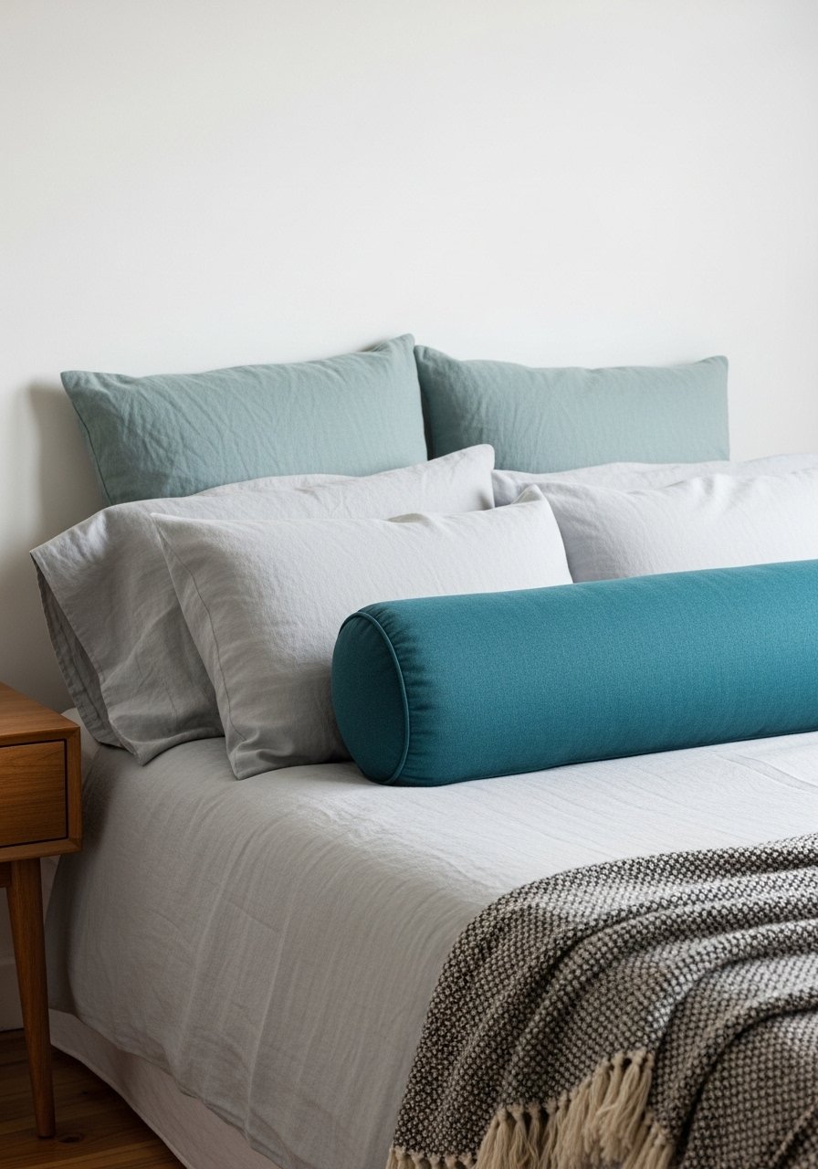
You can get a mid century look without repainting by keeping walls soft warm white and adding saturated teal textiles. I swapped two 22-inch linen pillow covers and a teal lumbar and the guest room stopped feeling like a hotel. This is fully renter friendly and low cost. The trick is the pillow formula of three layers behind and one slim lumbar in front, which gives structure and scaled contrast. Avoid mixing too many teal shades that fight each other. If you want an inexpensive test, buy teal velvet pillow covers and a small accent throw.
Wales Gray Accent Wall With Teak And A Red Throw

Wales Gray is soft enough to read neutral but it still has personality. Paint one or two walls and float a teak coffee table in front of them. I added a red linen throw and the room gained depth without feeling dated. Budget is moderate for paint plus one textile. Common mistake is overloading red; make red the spike, not the field. Try testing a Wales Gray sample on the wall next to a teak piece so you can see how the tones play together during the day. A red linen throw is an easy reversible touch.
Terra Cotta Accent Wall For An Eclectic Living Space

A single terra cotta wall anchors eclectic mid century decor better than full-room orange. I painted behind my sofa and suddenly mismatched pillows, brass lamps, and wood tones felt intentional. This is a semi-permanent choice and works best when the other three walls stay ashwood or warm cream. People often make the mistake of painting the wrong wall. Choose the wall that naturally draws the eye, like the one behind the main seating. If you worry about commitment, try a large framed art piece in terra cotta hues first. For a budget-friendly swap, consider terra cotta throw pillows.
Layered Teal And Brown Corner Seating
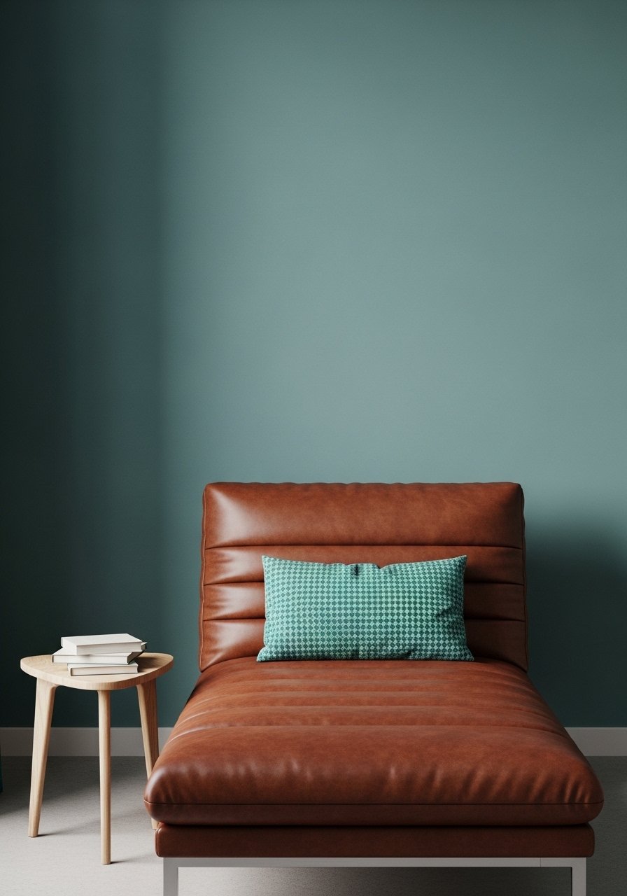
Layering two saturations of teal with warm brown creates depth that a single solid color cannot. In my den I painted one wall soft teal-gray and used a brighter teal cushion plus a brown leather chair. The formula is to use a muted teal on the largest surface and add one or two pieces in a more saturated teal. Avoid matching teal fabrics exactly. Pick one vivid item and two muted ones to make the contrast feel deliberate. This works well in living rooms and dens. I recommend trying muted teal throw covers and a small brown accent chair.
Deep Navy Dining Room With White Trim And Light Oak
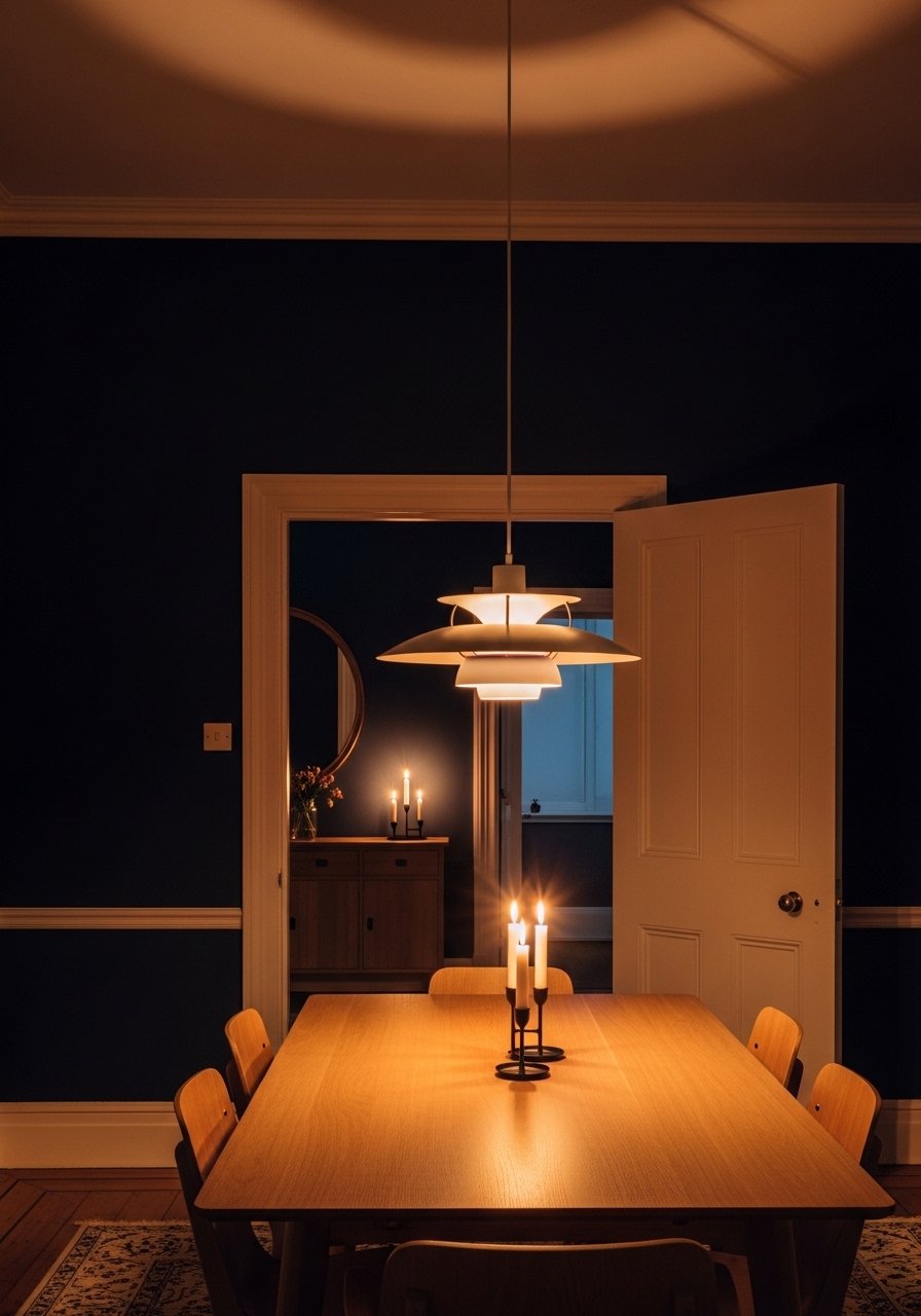
Navy has quietly become the new gray and it reads modern next to light oak. I painted my dining room navy and kept trim crisp white so the mid century roof lines read sharp. Navy can flatten a space if you use dark wood, so choose light oak or teak for contrast. Expect extra coats of paint and a satin finish for wipeability. A common mistake is using flat finish in dining rooms where fingerprints show. If you have a small apartment, paint only one wall navy and let white walls do the heavy lifting. Consider a pair of navy linen curtains for continuity.
Warm White Wall With Peel-And-Stick Wood Paneling Accent

Wood is the fifth wall and adding peel-and-stick paneling can read like authentic mid century without construction. I used warm white on all walls then applied light oak peel-and-stick strips to the TV wall. It grounded the room and made a cheap media unit look intentional. This is renter friendly and low fuss. Mistake people make is matching wood too closely to existing furniture. Aim for contrast so the paneling reads as feature, not camouflage. Test small panels and glue type before covering big areas. Try light oak peel-and-stick panels.
Mustard Accent Wall With Brass Touches For A Vintage Feel
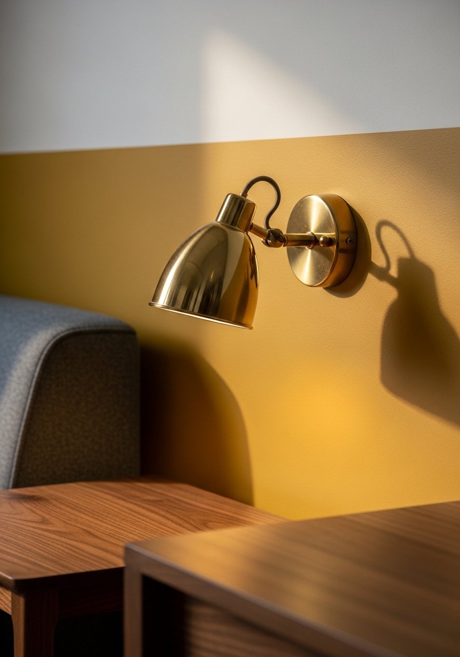
Mustard is classic mid century and it suits vintage brass. I painted a slim accent wall mustard and swapped drawer pulls for brass to tie everything together. The rule I used was 80/20 warm neutral to accent color so the mustard reads intentional and not overwhelming. A common error is painting a whole small room mustard which can close in the space. Keep it to one wall or accessories if your room is small. Brass picture ledges are an inexpensive way to echo the metal finish.
Off-White With Red Artwork For An Easy Update
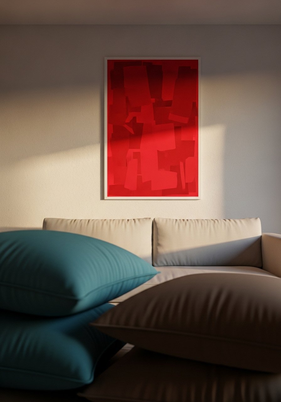
If you fear a red wall but want the energy, hang red art instead. I swapped a large red abstract in my entryway and the whole circulation path felt warmer. This is fully renter friendly and budget friendly. The mistake is choosing a print too small for the wall. Go big and let the art function like an accent wall. I follow a three-pieces rule for art groupings when needed. For a quick install try large red abstract print.
Soft Brown Living Room With Teak And White Accents
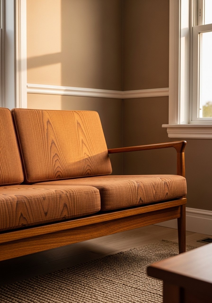
Brown walls can read modern when paired with teak and bright white trim. I painted our den a warm brown that reads cozy instead of dated because the trim and textile choices are light. The trick is picking a brown with yellow or ochre undertones rather than a muddy cool brown. People often pick the wrong undertone and it looks flat under artificial light. Test a 2×2 foot sample and observe it across the day. For textiles, grab 22-inch off-white linen pillows to keep contrast.
Green-Blue Entry With Minimal White Furniture
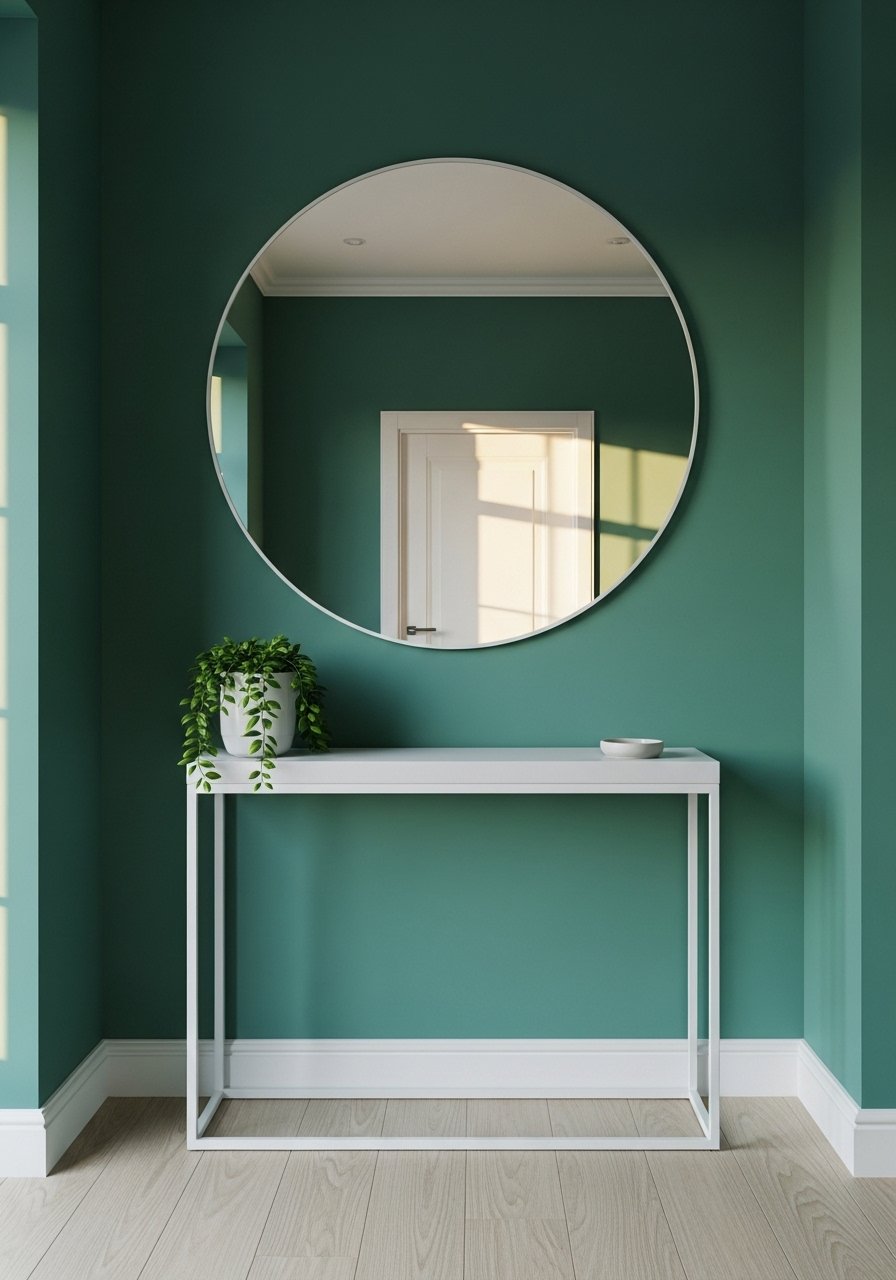
Green-blue walls give punch while staying grown-up. I painted my entry this color and used a white console so the space reads crisp. Avoid pairing this tone with dark espresso wood or it will compete. For small entries keep only one or two statement pieces. A common mistake is over-accessorizing, which makes the color feel busy. Swap in a teal velvet accent chair if you want a movable focal point.
Two-Color Color Blocking For A Dining Nook
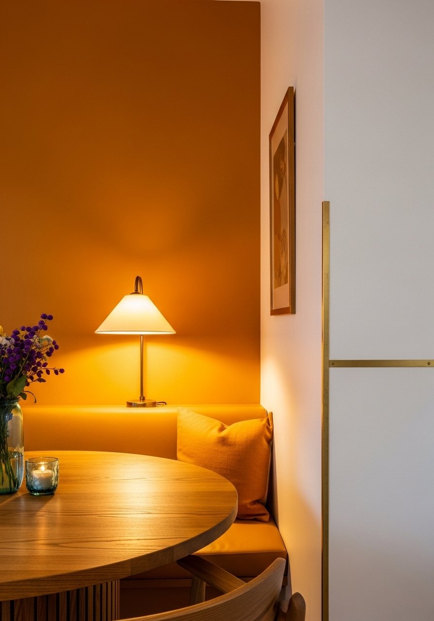
Color blocking is a mid century move that breaks up open plans. I painted an adjacent wall warm ochre and kept the other soft white to create a corner that reads like a deliberate room within a room. The key is clean lines and painter's tape for a crisp edge. Measure the visual weight by keeping the darker color to about one third of visible wall area. A common error is stripes that are too thin or uneven. For renters, try removable wallpaper panels instead. High-quality painter's tape makes this doable for DIYers.
Warm Cream Minimalist With One Statement Wood Piece
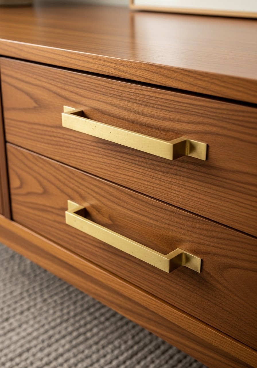
A warm cream base is deceptively powerful because it lets wood sing. I painted the whole apartment a warm cream and invested in one statement credenza. That single wood piece made the room feel edited and intentional. Budget varies mostly by the furniture choice. The mistake is thinking you need lots of accessories. Keep one or two textiles and let the wood do the talking. For smaller budgets, look for secondhand credenzas or a scaled-down walnut sideboard.
Navy Lower Wall And White Upper For Higher Ceilings
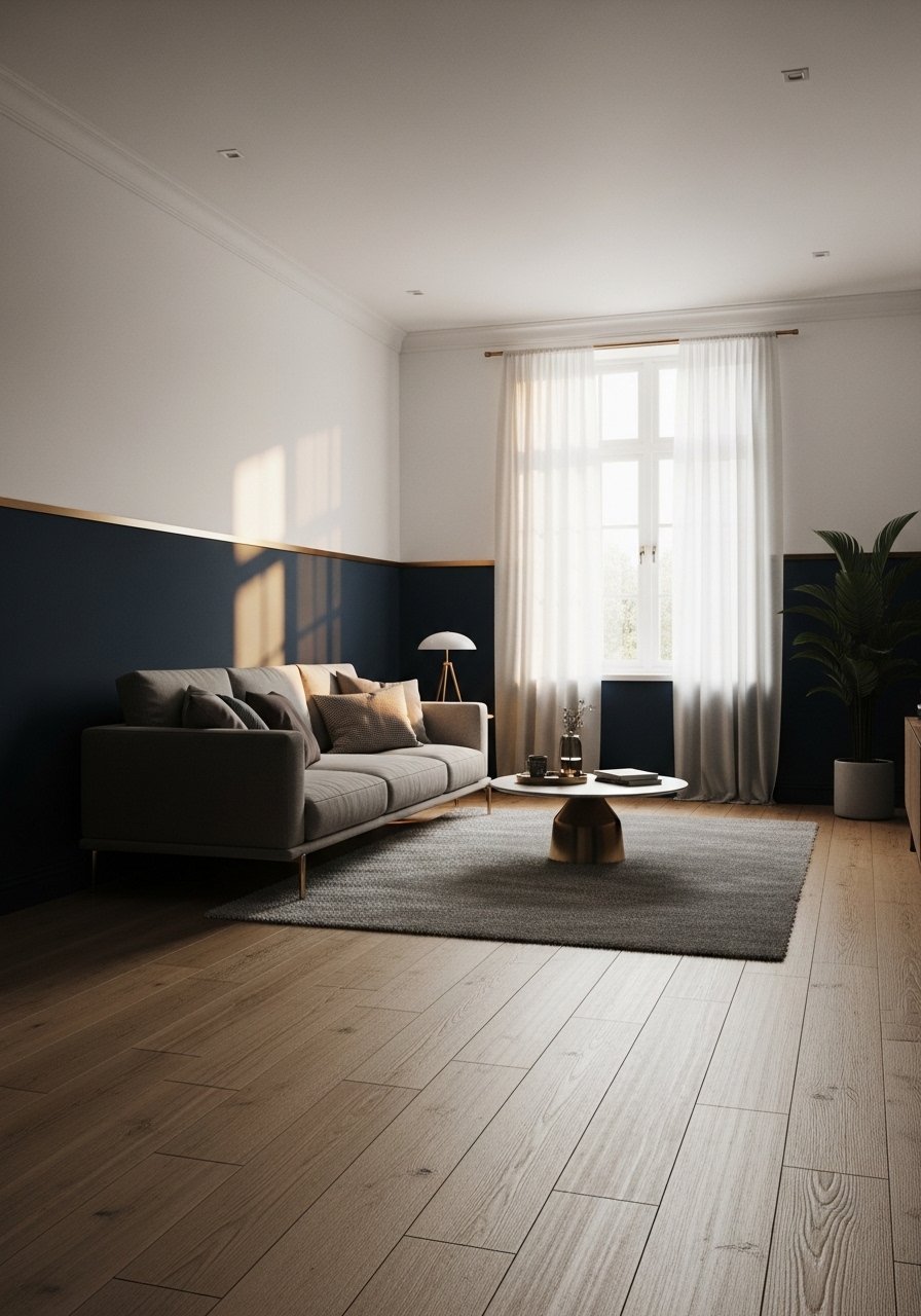
Painting the lower half navy and the upper half white makes ceilings feel higher and rooms feel anchored. I used a four-foot lower band of navy with white above and it visually stretched my living room. Precision tape work is essential and I recommend a satin finish below for durability. People often use a band that is too tall which then shortens the room. Keep the navy to about one third of the wall height. Add a thin brass trim strip for a mid century nod that you can remove later if needed.
Soft White With One Saturated Teal Focal Chair

If painting is off the table, a statement chair does the job. I put a teal velvet chair in a soft white room and it reads like a mid century focal without the commitment. This is renter friendly and flexible for small apartments. The common mistake is buying a chair too small for the scale of the room. Aim for one eye-catching piece and two neutral textures around it. For a quick purchase try teal velvet accent chair.
Your Decor Shopping List
- Honest pick for textiles: Velvet pillow covers, set of 4, 22-inch, teal and ochre mix. I buy two sets and rotate them seasonally
- Curtains that lift a room: 96-inch linen curtain panels in warm white for 9-foot ceilings
- Easy art swap: Large red abstract print 24×36 for an accent wall without paint
- Painter's basics: FrogTape painter's tape 1.88-inch for color blocking
- Peel-and-stick option: Light oak peel-and-stick panels for the wood wall idea
- Small splurge: Walnut sideboard mid century style for a statement piece
- Budget throw: Chunky knit throw in cream (~$35-55). Drape it over a sofa arm for texture
- Metal detail: Brass picture ledges 24-inch set for easy artwork swaps
- Dining room curtains: Navy linen curtains 84-inch if you paint a navy wall and want continuity
- Rug anchor: 8×10 jute area rug for grounding a mid century seating group
- Accent chair: Teal velvet accent chair for a movable focal point
Shopping Tips
- White oak beats dark wood in 2026. Design feeds have shifted completely. These white oak floating shelves look current, not dated
- Grab velvet pillow covers for $12 each. Swap them seasonally and the whole room reads different
- Curtains should puddle or kiss the floor, never hang halfway up. 96-inch panels are right for standard 9-foot ceilings
- One large plant beats five tiny ones. Try a 6-foot faux fiddle leaf fig where you need height without maintenance
- Matte paint hides texture but marks more easily in high traffic. Use a satin finish for dining rooms and entryways to balance durability and warmth. Satin interior paint sample kit helps you test finishes
Frequently Asked Questions
Q: How do I know if a warm ochre will read orange in my house?
A: Paint a 2×2 foot sample and look at it in morning and evening light for three days. If it looks too orange under your evening bulbs, pick a shade with a softer undertone or test a sample with less saturation.
Q: Can I mix teak furniture with navy walls without it feeling heavy?
A: Yes. Navy pairs best with light oak or teak, not espresso. Keep trim white to create contrast and use one bright textile to prevent the room from flattening.
Q: What is the quickest renter-friendly mid century update?
A: Swap pillows, add a statement chair, and hang one large art piece. Most tenants can do these in an afternoon. Teal velvet pillow covers are an easy place to start.
Q: How do I layer two shades of teal without it looking random?
A: Use a muted teal on the largest surface like a painted wall or rug, then add one saturated teal in a single piece such as a chair. Add one neutral brown element to anchor it. Odd numbers of accents read intentional.
Q: Will dark walls make a small room feel smaller?
A: Dark walls can if you cover all four walls. Use them on one wall or as a lower band to anchor the room and keep ceilings feeling tall. Also use light wood furniture to maintain contrast.
Q: How do I fix a paint color that looks wrong after drying?
A: Prime over it if you want to repaint quickly. Lighter colors need more coats over dark paint. For a cheaper fix, add large textiles or a big artwork to change how the room reads while you decide.
