
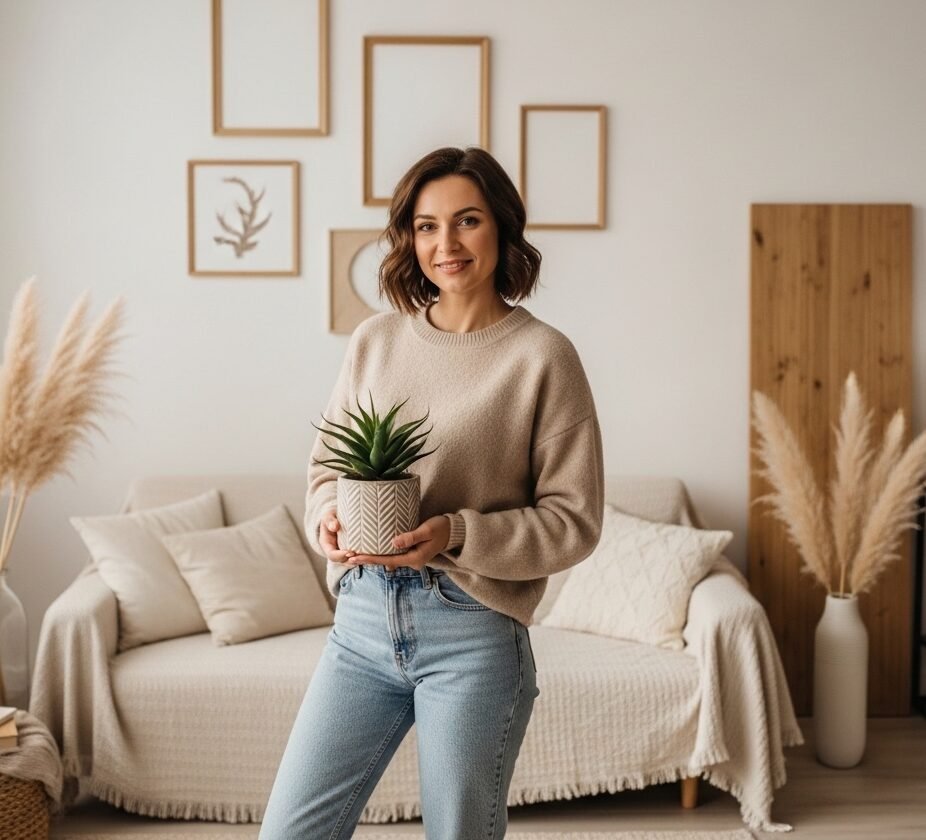

My friend walked into my apartment last month and said "this looks like a real adult lives here." Highest compliment I have ever received. I finished the dining room wall last weekend and it finally felt warm enough to sit around, not just look at. The difference came from small choices, not splurges.
These ideas lean soft modern and cottagecore, with most items under $75 and a few splurges near $150. They work for dining rooms, breakfast nooks, or a small open-plan kitchen corner that needs personality.
Soft Ombre Accent Wall for a Gentle Focal Point
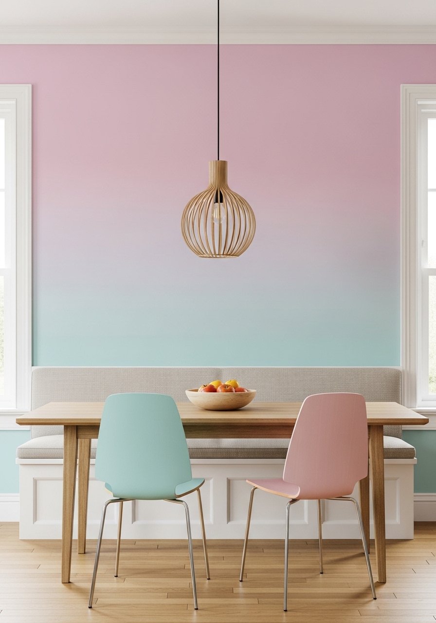
The ombre wall stopped my dining area from feeling flat. Paint three shades within two steps of each other on a fan deck, then tape horizontal guide lines every 10 inches for a seamless fade. What makes it work is scale, so keep the darkest band no wider than one third of the wall height. For paint testing, walk the samples in morning and evening since lighting trips up matches about one in three times. Common mistake is starting the blend without enough overlap. If you rent, try a removable pastel wallpaper panel first, like this peel-and-stick pastel wallpaper panel, which lets you practice the look without repainting.
Pastel Gallery Wall with Mixed Frame Sizes
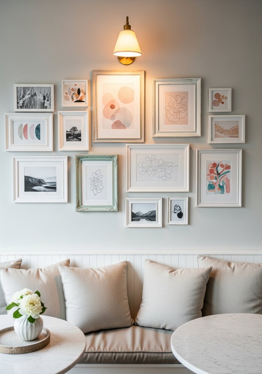
I built a gallery wall that finally looked intentional after I used one anchor piece and kept 3-inch spacing between frames. The rule I use is odd numbers and a single dominant piece about 40 percent larger than the others. People often hang everything at eye level and forget table height, which makes dining chairs bump the frames. Try a pastel canvas set for instant cohesion. A detail most posts skip is measuring from the table top to the center of the main piece, not from the floor. That keeps the art connected to the furniture.
Framed Botanical Prints for a Soft Vintage Vibe
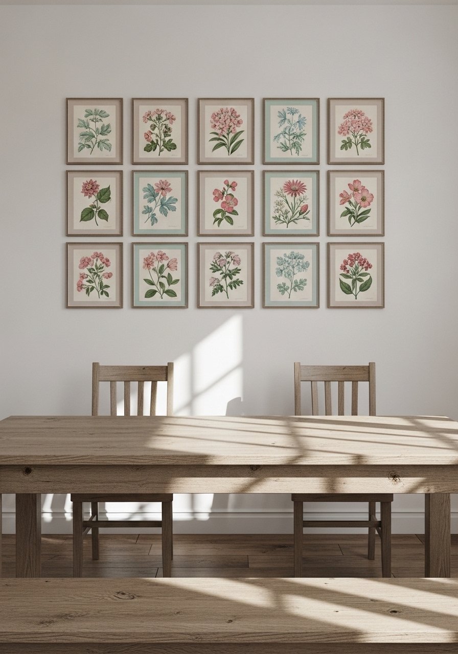
Botanical prints make a dining room calm and collected. I chose 11×14 frames and left 2 inches of mat around each print to let the pastels breathe. Many people crowd the frames too close which reads busy instead of serene. If you want a low-cost option, these botanical print sets come framed and save time. One detail I learned is to matte the prints; the breathing room makes a small room look 10 percent larger in photos and real life.
Pastel Plate Display for Playful Texture
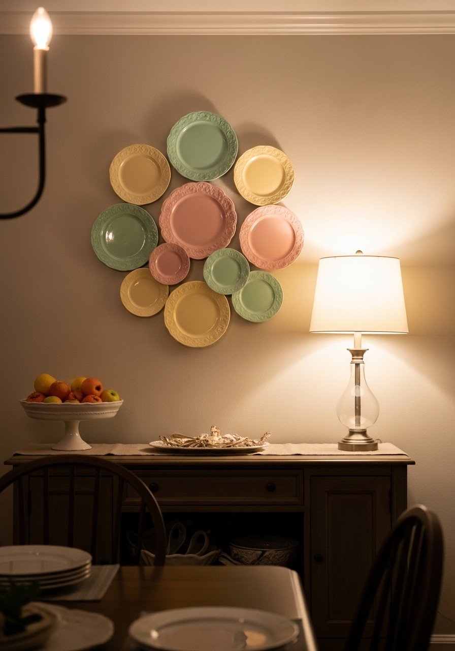
Hanging pastel plates turned a bland wall into something you want to inspect. Use plate hangers and plan your layout on the floor first. I space plates one and a half plate widths apart so the cluster reads cohesive. The mistake is centering the cluster on the wall instead of over the buffet. Center it over furniture to make the display feel anchored. Try a mix that includes at least one patterned plate to break the monotony and grab a set like these pastel decorative plate set if you do not collect vintage pieces.
Pastel Wallpaper Panel as a Renter-Friendly Statement
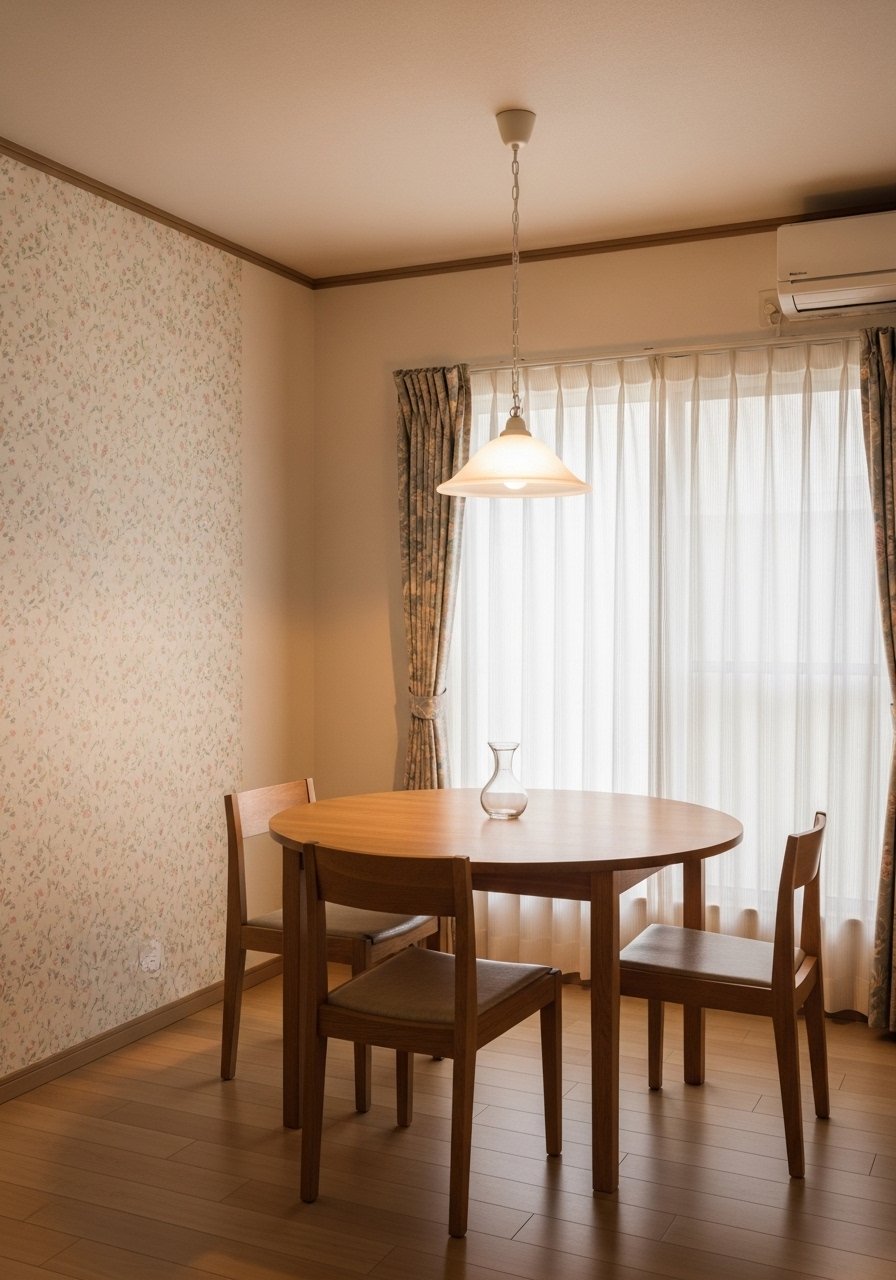
I used a peel-and-stick wallpaper panel when painting was not an option. It made the whole room feel edited and cost less than a single quart of specialty paint. Common mistake is choosing too-small repeat patterns, which vanish at a distance. Pick a panel that has a repeat at least 20 inches tall so the pattern reads across a table. If you worry about pattern scale, order a 12×12-inch sample first. The affordable pick I used was a removable pastel floral wallpaper.
Oversized Pastel Canvas for Minimalist Charm
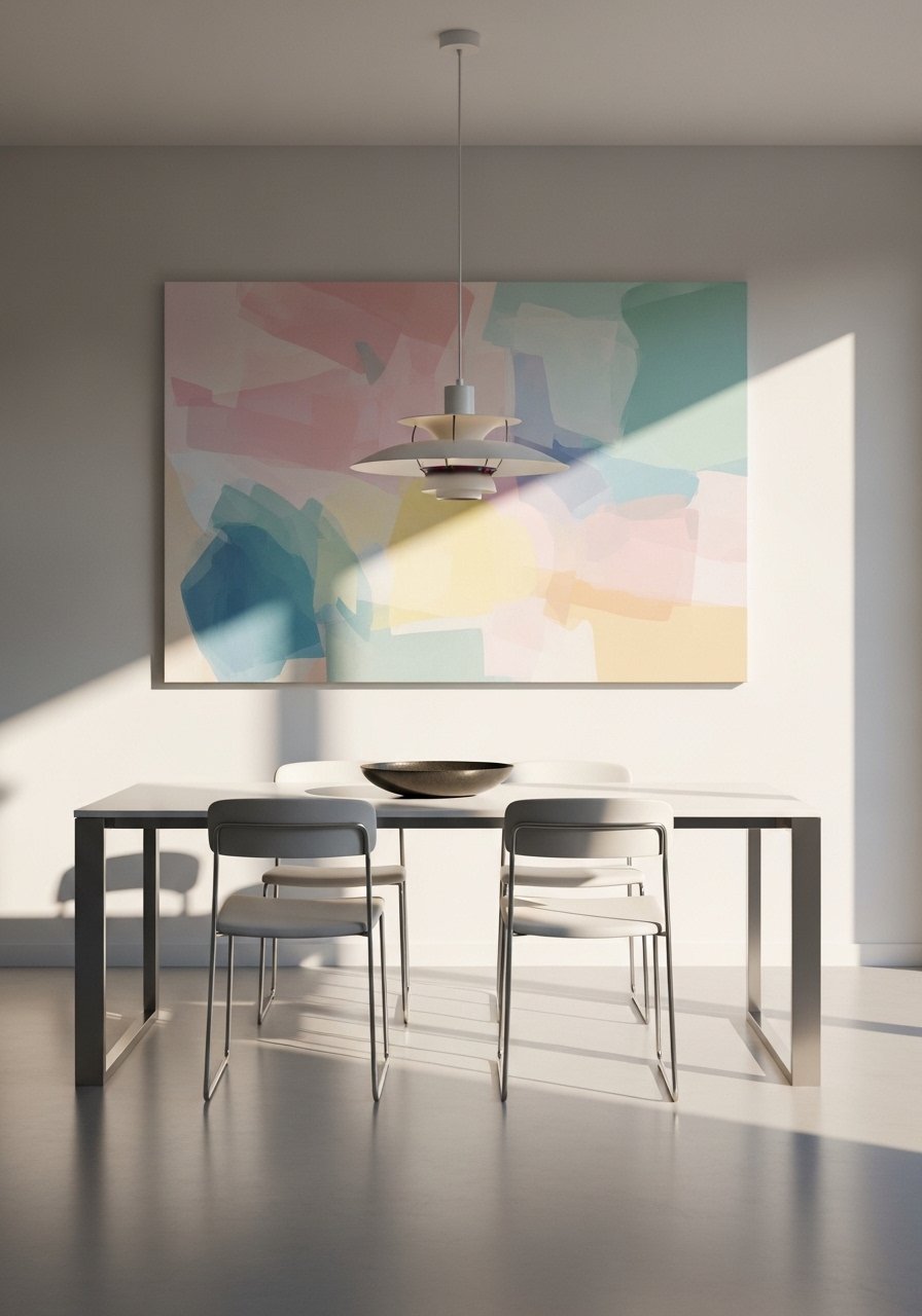
One large canvas can replace a busy wall of small pieces and make a small dining spot feel grown up. I went with a 40×60 inch scale to match a 6-foot table. The common error is buying a canvas that is too small for the wall. To test proportions, tape the outline of the canvas on the wall first. For a ready option, this large pastel abstract canvas came in handy. A detail most listicles skip is centering the art to the seating, not to the wall, when the table is off-center.
Textured Macramé Wall Hanging in Soft Pastels for Boho Dining
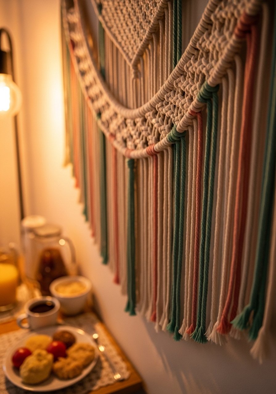
A macramé in blush or mint adds texture that photographs beautifully and invites touch. I picked a 30-inch wide piece for a 4-foot wall so it reads proportionate, not overwhelming. Newbies often hang these too high. Hang the bottom third at eye level so the fringe frames seating. I found a budget option that still looks handmade with this pastel macramé wall hanging. A fresh angle most guides skip is pairing the hanging with a small ceramic vase in a complementary pastel to ground the look.
Painted Chair Rail with Two-Tone Pastel for Classic Detail
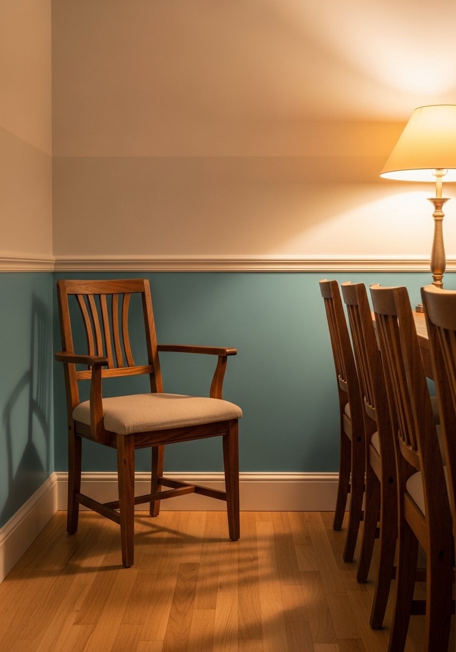
I painted a chair rail in a deeper pastel and a lighter tint above to add architectural interest without wallpaper. The tip is to keep the lower color 2 to 3 shades darker on the paint strip. People often pick colors that read identical under artificial light. Test with samples at night and day because scanners fix seven in ten botched matches. If you want to avoid repainting, use a washable paint on the lower half for durability. For tools, I used a quality angled brush and a paint-edge tape kit to keep the line crisp.
Floating Shelves with Pastel Backer for Curated Displays
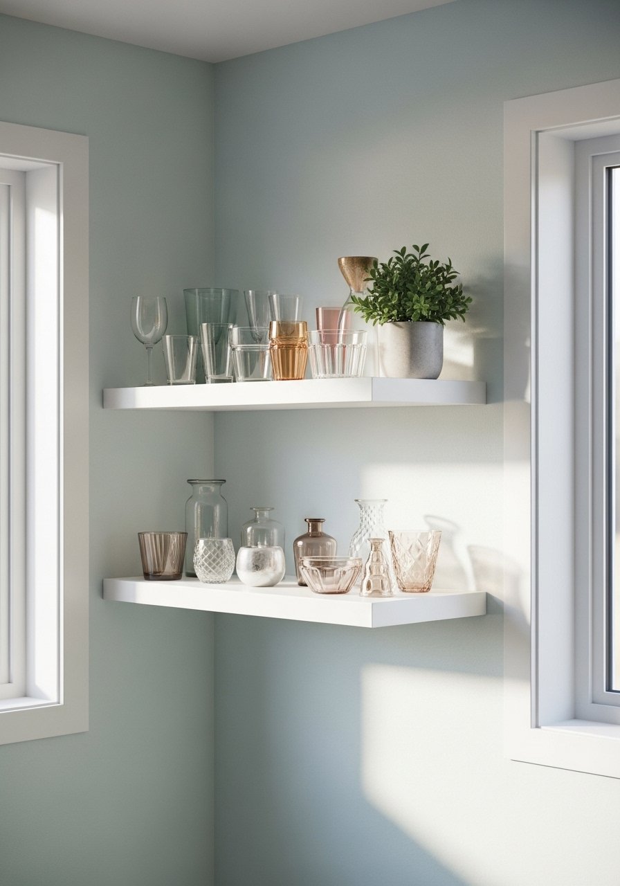
I added floating shelves with a painted pastel back and it made my glassware pop. Pick shelf depth to match plates or bowls, 10 to 12 inches is forgiving. The common error is using too many objects which looks cluttered. Limit each shelf to three groupings and leave negative space. For renters, paint a removable plywood back that hooks over screws. I used these white floating shelves and painted the back panel a soft peach for contrast.
Pastel Mirrors to Bounce Light and Open Space
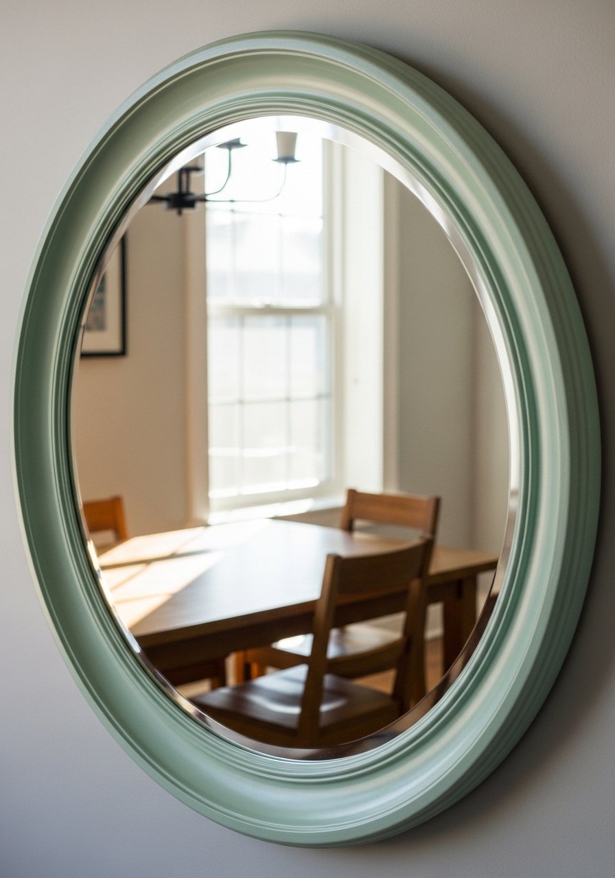
A mirror framed in a pastel tone doubled the natural light and made my narrow dining room look wider. Hang mirrors so their center sits at about 60 inches from the floor in most rooms, and slightly lower if the table blocks sightlines. Newbie mistake is hanging a mirror too high above the buffet. A pastel frame softens the reflection and ties into textiles. I picked this round pastel wall mirror for a mid-range price. Quick detail most posts miss is angling the mirror slightly to catch the best light in the late afternoon.
Hand-Painted Chalkboard Menu in Pastel for Casual Dining
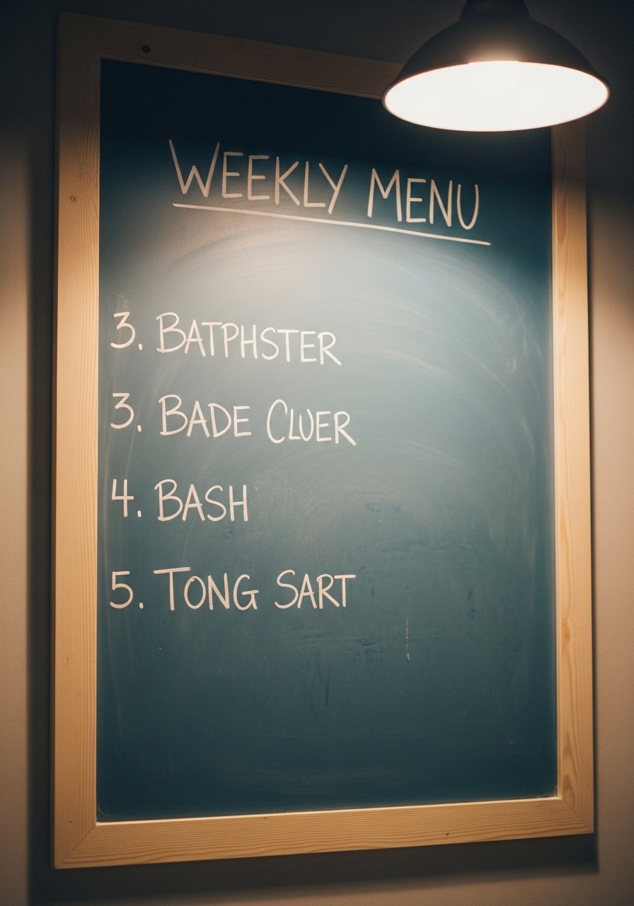
I painted a small chalkboard in a dusty pastel for menus and notes. It keeps the room playful and practical. Most people use black which reads harsh against soft pastels. Use a pastel base so the white chalk stands out without glare. A 24×18-inch board is great for a family of four. If you rent, use a removable frame and command strips instead of screws. I linked a helpful option, this chalkboard with wooden frame. A detail few guides include is seasoning the board with the side of a chalk stick before writing for a more even finish.
Your Decor Shopping List
Textiles
- Honestly the best $45 I have spent. Chunky knit throw in cream, 50×60 inches. Drape over a chair for instant softness
- 22-inch linen pillow covers, set of 4 in blush and sage, down-filled inserts sold separately
Wall Decor
- Peel-and-stick pastel wallpaper panel, 24×36 inches, removable for renters
- Pastel canvas wall art set, includes two 16×20 canvases for small walls
Shelving and Hooks
- White floating shelves 12-inch depth, set of two, hardware included
- Round pastel wall mirror 24-inch, lightweight and easy to hang
Budget Finds
- Pastel decorative plates set of 6, mix of solid and patterned
- Pastel macramé wall hanging 30-inch, handmade look without the price tag
Shopping Tips
White oak beats dark wood in 2026. Design feeds have shifted completely. These white oak floating shelves look current, not dated.
Grab these velvet pillow covers for $12 each. Swap them seasonally and the whole room feels different.
Curtains should puddle or kiss the floor, never hang halfway up. These 96-inch linen panels are the right call for standard 9-foot ceilings.
Everyone buys five small succulents. One single 6-foot faux fiddle leaf fig has ten times the visual impact.
Buy paint or wallpaper samples and test them in the room for a full day. Scanners fix seven in ten botched matches, but the eye still needs to make the final call.
Frequently Asked Questions
Q: Can I mix pastel patterns without the room looking messy?
A: Yes. Stick to one bold pattern and two supporting solids. Use a repeat scale at least 20 inches tall for the pattern and keep the color palette to three pastels plus a neutral. The plate display and gallery wall ideas pair really well with a single patterned table runner.
Q: What size art do I need over a 6-foot dining table?
A: Aim for artwork that is about two thirds of the table width, so roughly 40 inches wide for a 6-foot table. Center the art to the seating, not the wall, if the table is off-center. The oversized pastel canvas idea gives that calm, edited look.
Q: I rented, can I still try these looks without repainting?
A: Absolutely. Use peel-and-stick wallpaper panels, removable framed art, and painted backer boards for shelves. The pastel wallpaper panel idea is renter-friendly and lets you test scale without commitment.
Q: How do I prevent pastel paint from looking dull or muddy?
A: Check pigment bias before you commit. Mix test swatches and view them under your room lighting at different times. Lighting trips up matches about one in three times, so walk the samples all day. If you need technical help, stores can scan fabrics and Scanners fix seven in ten botched matches, but always tweak with your eye.
Q: Are faux plants okay in dining rooms?
A: Both real and faux work. Use a tall faux tree like a 6-foot fiddle leaf fig where light is low. For real plants, choose easy care varieties like snake plant or pothos and use saucers under pots for dining safety.
Q: How do I scale a gallery wall in a small dining nook?
A: Use smaller frames with larger mats to create breathing room and keep spacing at 2 to 3 inches between frames. For small spaces, an odd-number grouping of five pieces usually fits better than seven.
