
My neighbor stopped me on the way out and said my facade looked like a painted postcard. I had painted the door once in a frantic weekend and left the trim alone for years. After repainting the trim and adding two matching pots the house actually read as thoughtful instead of last-minute. Small color moves outside matter exactly as much as they do inside.
These ideas lean playful-modern with a soft Indian palette. Most moves cost under a few hundred rupees for samples and under a few thousand for full work, with a couple splurges for quality paint. They work for bungalows, narrow row houses, or apartment entrance facades where first impressions count.
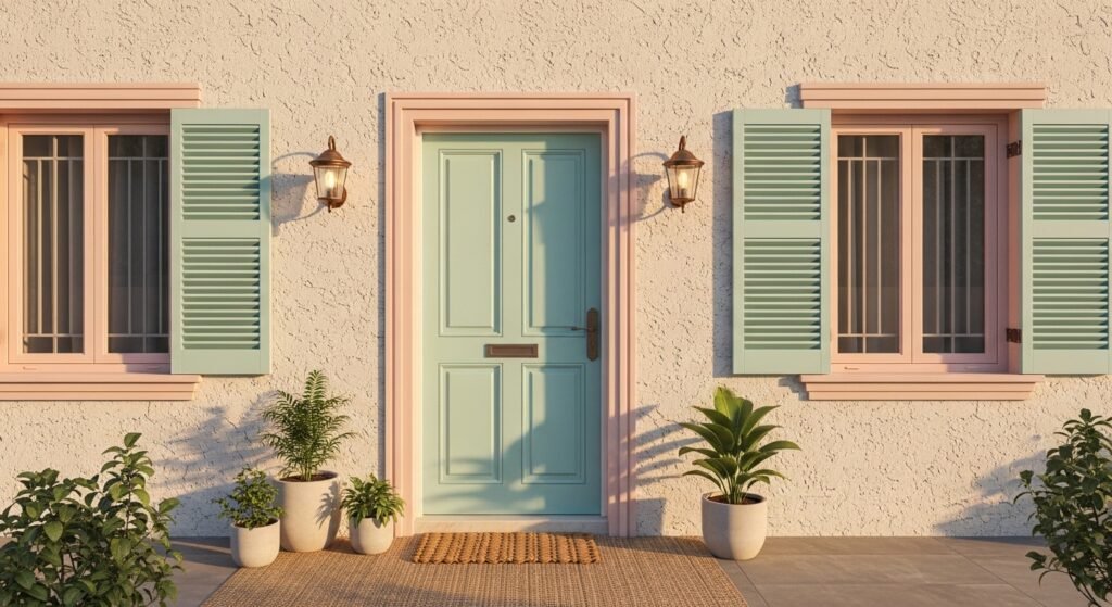
Soft Mint Door with Pale Terracotta Accents
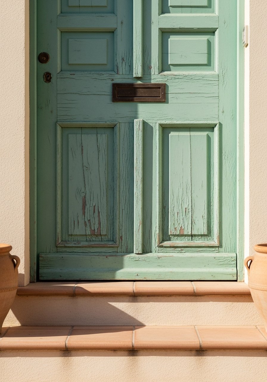
The moment I painted my door mint I realized the whole elevation felt friendlier. Mint reads fresh against natural stone, and pale terracotta on the steps gives a grounded counterpoint. Use a 60/40 ratio where the main color covers the door and a single large accent such as the step or a planter uses the second color. Budget can be tiny if you test with 2×2 foot swatches first. Get a small tester from any paint counter but bring a physical chip for a spectrophotometer scan at the desk. I used a local scan service and then bought paint, which saved me two redo coats. A common mistake is trusting a photo or phone snap. Eight out of ten color fails come down to the light you're in.
Blush Trim to Soften a White Façade
Most people paint trim pure white and then wonder why the house looks sterile. Blush trim adds warmth without shouting. I picked a satin eggshell for trim so it cleaned easily and still read as softened against the white. Test a 12-inch strip at eye level and step back from 20 feet to check distance effect. A typical budget is two tester pots before committing. Avoid using a flat finish on trim because it hides details. Also try asking for a competitor formula at the counter if you liked an old commercial sample, since stores often have those codes saved. Machine scans nail it 95% of the time, eyeball about 7 out of 10.
Powder Blue Shutters with White Lace Details
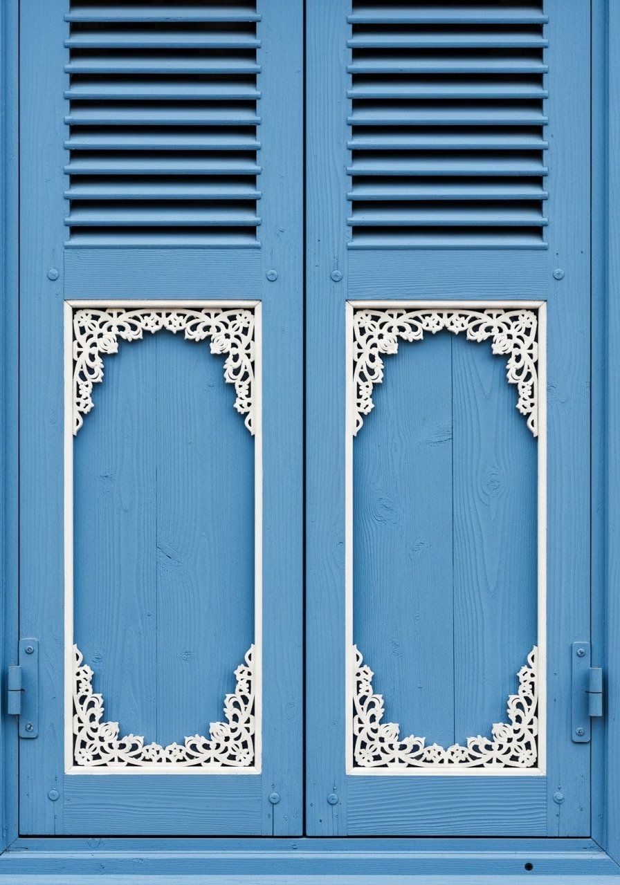
I hand-painted tiny white fretwork on my shutters and it read more intentional than fancy hardware. Powder blue shutters keep the look calm and look especially good against pale stone or warm beige walls. The key is scale. Keep the lace detail to less than a third of each shutter width so it reads delicate not busy. A common mistake is overworking the detail and making it look like a stencil experiment. For a renter-friendly option, paint plywood shutters off-site and hang temporary brackets. Bring a fabric sample if you need the blue to match curtains inside. A quarter of repaints happen because the first match bombed.
Pastel Ombre Entry Steps for Subtle Drama
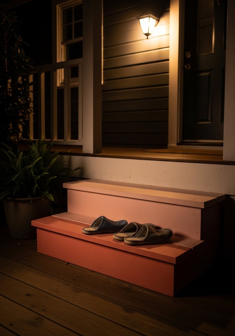
Before I tried an ombre step, my entry was anonymous. Gradients work because they read as a deliberate design choice rather than a single accidental shade. Paint the risers in three steps, each 20 centimeters high, and blend with a soft brush to keep edges from looking rigid. Budget depends on paint quality, but a single good exterior tester and a small can of quality acrylic will do the trick. Avoid sharp stripe lines which date the look. If you like the idea but rent, paint thin plywood risers and prop them in place. Cross-reference the mint door idea, since complementary ombre tones on steps tie to door color nicely.
Pale Sage Wall with Terracotta Planter Layering
There is a fine line between washed-out and gentle when using sage on large exterior walls. I found success by pairing sage with saturated terracotta planters and wooden shelves. Use a 70/30 rule where the wall is 70 percent soft sage and accents take the remaining 30 percent. Use an eggshell outdoor finish for durability and note the wall texture will absorb light differently from a smooth sample. One mistake is testing only small chips in-store. Prop 2×2 foot swatches in place at different heights and check in morning and late afternoon. Also try a phone light meter app to compare readings between spots. That renter cardboard trick saved me one repaint.
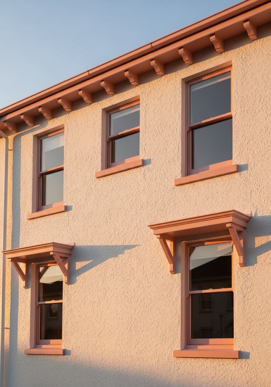
Sunset Peach Accent Band for Balcony Rails
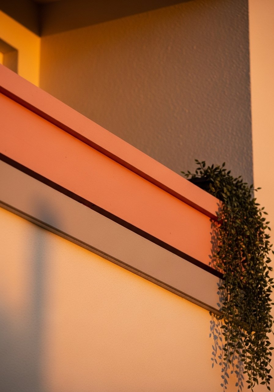
I painted a narrow sunset peach band along my balcony rail and suddenly the whole elevation read intentional. Keep the band no wider than 30 centimeters on typical low parapets or it will overpower. Use painter's tape and measure twice. Budget is small for the paint, but invest in outdoor primer for metal. A common error is painting directly on rusty metal without a bond primer. If you want to echo interior colors, bring the exact fabric swatch or ask for a scan at the paint counter. Pigment bias matters when tweaking peach tones. Reds mix strangely, so pick a peach leaning warm or cool before you add more pigment.
Mint-Grey Contrast with Natural Wood Door Frame
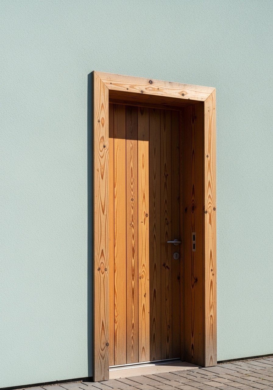
There is something about raw wood against a pastel that makes the whole facade read designed not painted. I stripped and sealed my frame and left it natural to balance a mint-grey wall. When pairing wood, test the finish and keep the stain one shade darker than the door frame edge. A practical step is to match sheen first, because the finish changes perceived color. Many people order samples in the wrong sheen and then complain the match is off. Bring a small wood or fabric sample into the store for a spectrophotometer scan and have the paint counter note the tint ounces per gallon for batch consistency.
Soft Lavender Accent Nook with Weathered Tile
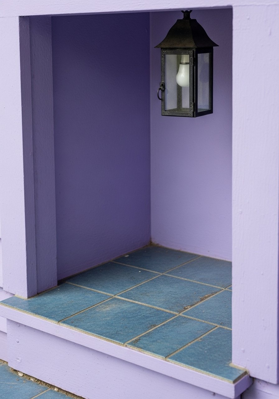
I rescued a neglected porch by painting the niche soft lavender and relaying one row of weathered tiles. Nooks handle saturated pastels because they are smaller planes. Keep the lavender to the interior of the niche and use a neutral on the surrounding wall for contrast. A mistake people make is choosing too bright a lavender for a shaded nook. Test in real light for 48 hours before committing, and use a durable exterior enamel in high-traffic porches. For renters, paint a removable pre-cut panel in lavender and lean it in place, so you get the effect without permanent work.
Multi-Gallon Matching and Batch Notes for Large Facades
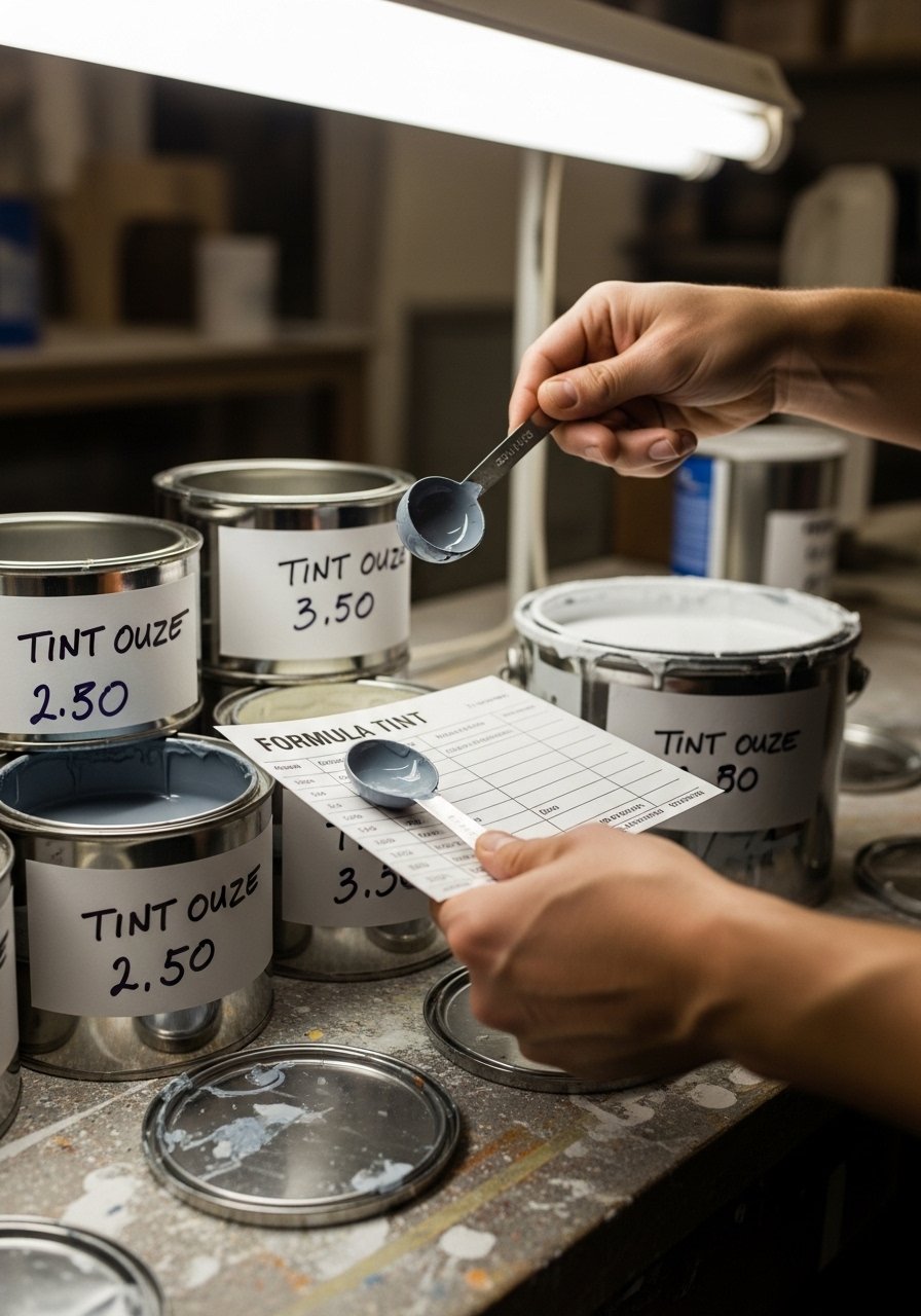
When I painted the long sidewall last summer I learned to print the tint ounces and write them on each can. For large facades buy all paint at once if possible and note the oz per gallon from the first can. If you must buy in batches, keep the formula card and have the counter match exactly. A lot of people eyeball successively mixed cans and end up with subtle shifts. Machine scans and formula hand-offs reduce that risk. Also remember texture matters. Rough rendered walls will need more paint and will read slightly darker than a smooth sample. Keep a test strip at the finished sheen to compare with any future touch ups.
Your Decor Shopping List
Textiles
- Honest pick that softens entry: Chunky knit throw in cream (~Rs. 2,500). Drape over a bench for a softer look
- Pillows for porch bench: 22-inch linen pillow covers, set of 2 in blush and mint
Wall and Trim Supplies
- For small tests and renter hacks: Paint sample tester set 2-ounce (~Rs. 300-600)
- For mounting removable panels: Lightweight plywood sheets 2×2 feet (~Rs. 700 each)
Planters and Plants
- Terracotta staple: Unglazed terracotta planter medium (~Rs. 600)
- Tall statement plant for balance: Artificial fiddle leaf fig 6ft for low-maintenance height
Tools and Test Gear
- For light checks and apps: Pocket light meter phone attachment (~Rs. 1,800). Similar options at local camera stores
Shopping Tips
White oak beats dark wood in 2026. Design feeds have shifted completely. These white oak floating shelves are great for showing off pots and small accents.
Grab these 96-inch linen curtain panels for doors and large windows. Longer curtains make openings feel taller and more intentional.
If you are renting, test on cardboard cutouts first. Poster board pack 2×2 feet is a cheap way to prop color samples without painting walls.
Tool to bring to the paint desk. Phone light meter app accessory helps you check light differences across morning and evening spots.
Frequently Asked Questions
Q: How do I know if a pastel will look right in both morning and evening?
A: Paint two 2×2 foot swatches and observe them in morning sunlight and at dusk. Eight out of ten color fails come down to the light you're in. Use a phone light meter if you want numbers not guesses.
Q: Can I match a discontinued color from an old house paint chip?
A: Yes. Bring a clean physical chip to the paint counter and ask for a spectrophotometer scan or a competitor formula lookup. Machine scans nail it 95% of the time, eyeball about 7 out of 10. Have the store print the tint ounces per gallon for future batches.
Q: What is a cheap renter-friendly way to try an ombre or accent band?
A: Paint removable plywood panels or poster board strips and lean them into place. That gives the visual without commitment and lets you test scale. Poster board pack 2×2 feet works well.
Q: Do I need to match sheen across samples and final paint?
A: Yes. Sheen changes how a color reads. Test the final sheen on your swatch and do a small patch at the intended finish before buying gallons.
Q: Why did my custom mix come out muddy when I tried adjusting pigment at home?
A: Pigment bias can throw red mixes off, so small tweaks matter. It is faster to ask the counter to add tint drops into a neutral base while you watch. A common mistake is adding large pigment amounts and overshooting the tone.
Q: Should I use real or faux plants on the stoop?
A: Both are fine. A single real tall plant like a fiddle leaf fig makes an impact, but a good quality artificial fiddle leaf fig 6ft gives height without upkeep.