

Spent $400 on a new coffee table. Room still looked off. Spent $35 on a throw and three candles. Suddenly everything clicked. That throw softened the edges and the whole palette read calmer.
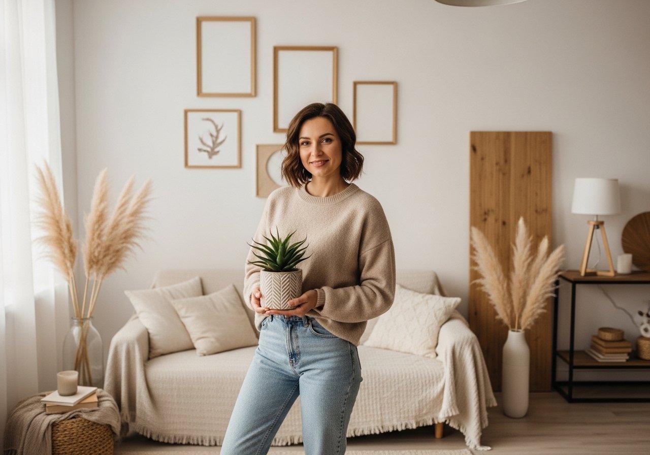
I lean minimalist but I like soft pastels, not candy colors. These ideas skew soft, restrained, and mostly budget friendly with a few splurges in the $100 to $150 range. They work in living rooms, bedrooms, nurseries, and small entryways where a pastel touch stops a space from feeling clinical.
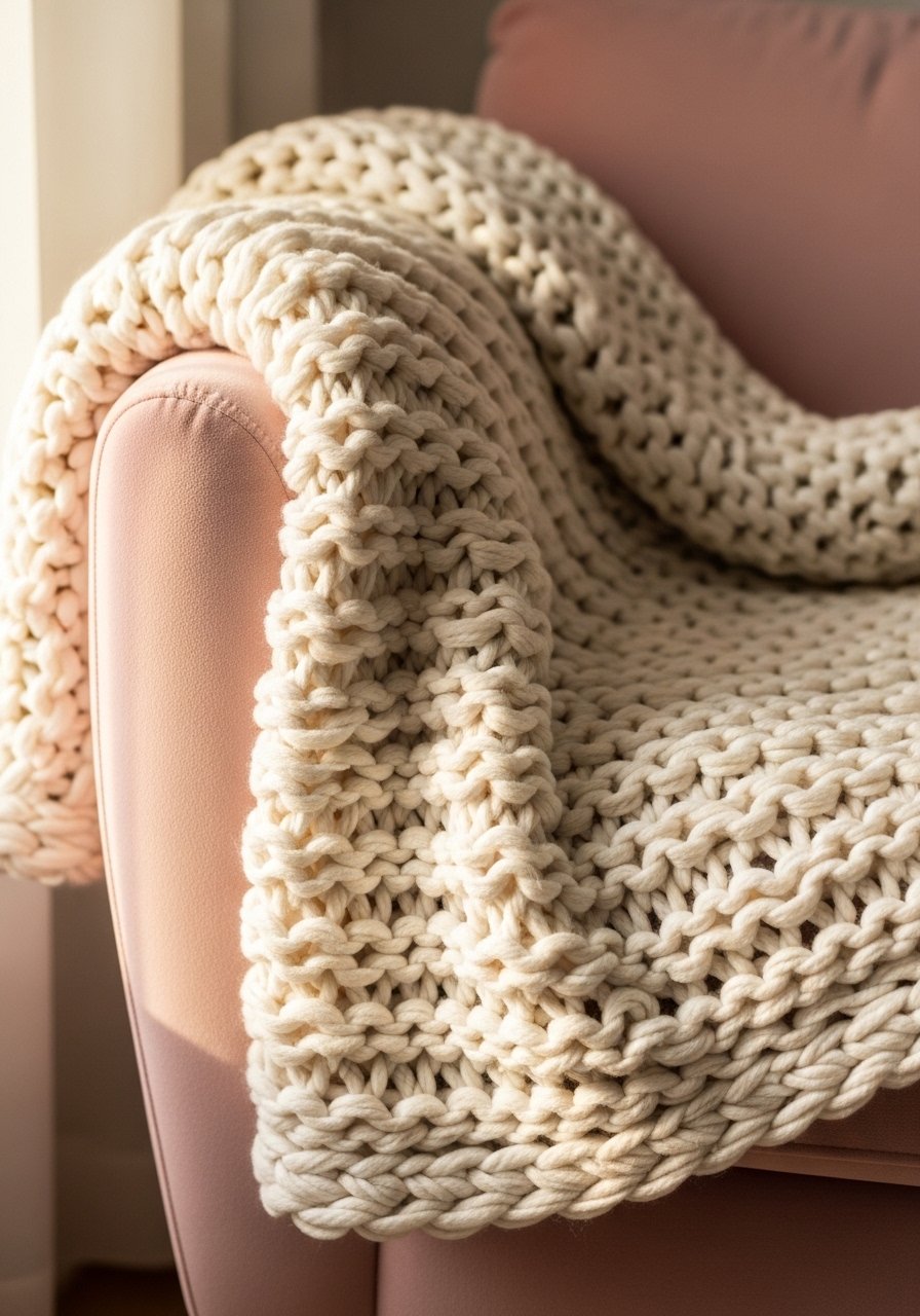
Layered Pastel Throws For Instant Softness

The moment I draped a chunky knit throw over the arm of my gray sofa, the room stopped feeling flat. Use a 50/50 mix of neutral and pastel throws, one folded and one casually draped, so the pastel reads intentional rather than juvenile. Budget: $25 to $60. I love a 50-inch by 60-inch chunky throw in cream and a thinner 48-inch by 72-inch pastel throw for contrast, like this chunky knit throw in cream layered with a blush cotton throw. Common mistake is using two identical textures; your eye needs one soft and one slightly smooth. A quick tip is to tuck the folded throw under the sofa arm by one third to keep the look tidy.
Muted Pastel Wall Paint With Dry Swatch Test
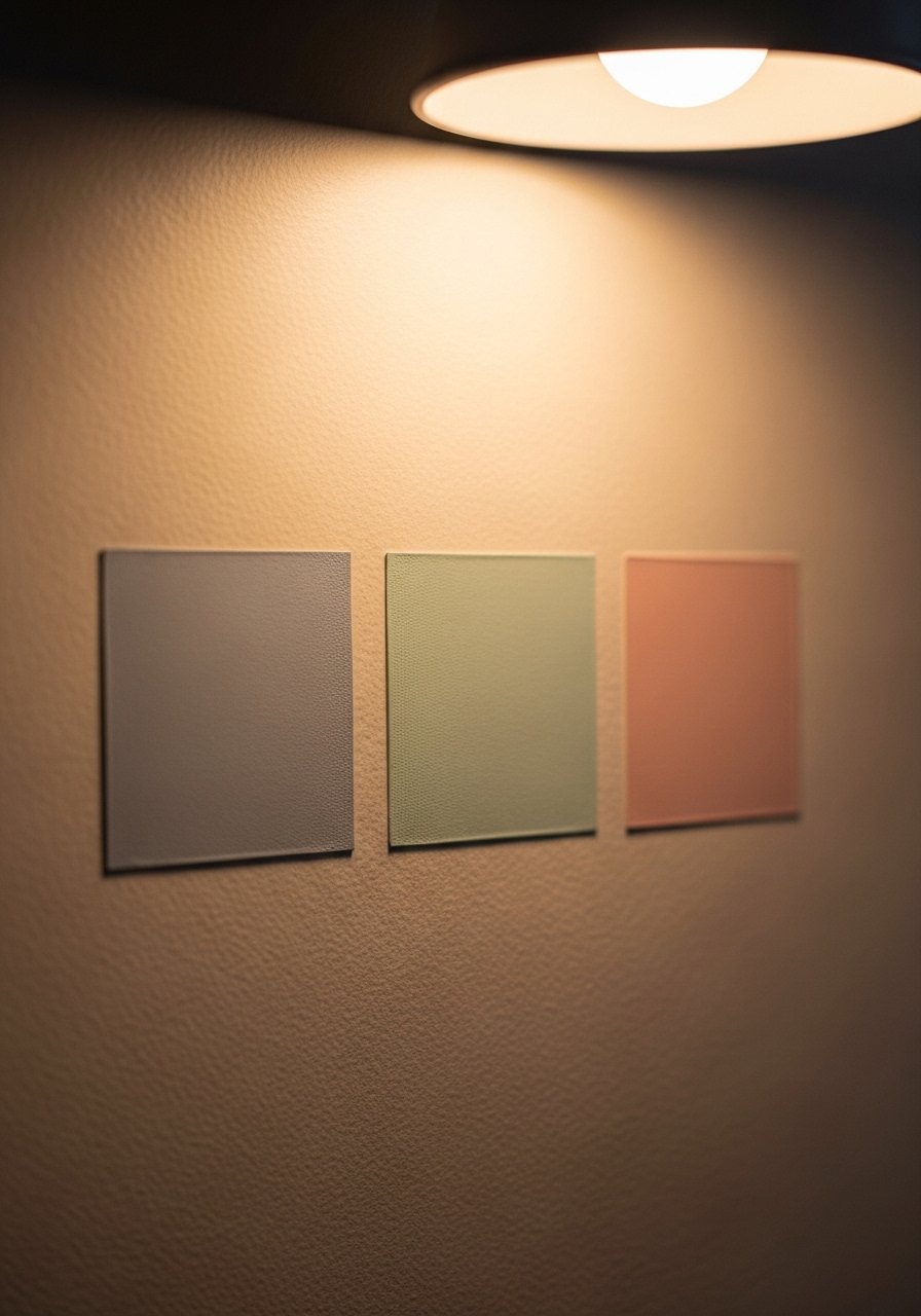
I always test paint in the actual room because Most mixes flop on dry, so test small. Paint wet darker than you want, then let it dry overnight on a 12-inch square of scrap drywall. Use the color wheel first to pick the hue family, then bring a tiny complement to dull brightness if the pastel reads too candy. For renters, try peel-and-stick sample sheets or small sample pots. I paired a pale mint with a neutral trim and used Benjamin Moore advance for trim where sheen mattered. A common fail is matching on a phone photo. The paint will look different by the window and near lamps.
Minimalist Pastel Gallery Shelf For Entry

A picture ledge keeps things minimal and lets you swap art without new holes. I use a single 36-inch ledge at 48 inches from the floor and lean three pastel prints, staggered heights. Brass or white oak ledges read softer than heavy frames. I found brass picture ledges for under $25 that let me rotate prints and postcards, like these brass picture ledges. Mistake to avoid is crowding the ledge. Leave one small empty space so the shelf breathes. Pair this with the curtain trick below to make the entry feel taller.
Pastel Linen Curtains Hung High To Add Height
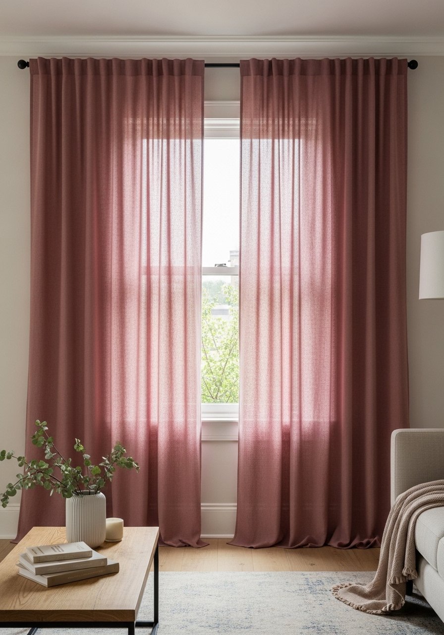
Most people hang curtains right at the window frame. That is why their rooms look shorter than they are. Hang 96-inch linen panels six inches above the trim and let them kiss or puddle slightly on the floor. For a soft look pick dusty rose or soft sage in lightweight linen. These 96-inch linen panels are my go-to for 8 to 9 foot ceilings. A common error is choosing heavy blackout fabric for a pastel minimalist scheme. You want light diffusion, not a flat wall of color. If you have low ceilings, hang at the top of the door frame instead.
Soft Pastel Rug Layering For Depth
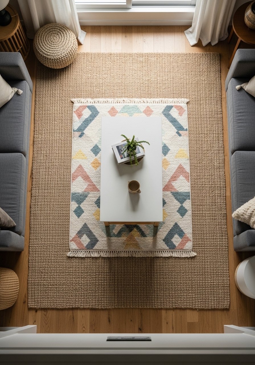
Rug layering solves too-small rug syndrome. Start with an anchor rug like an 8×10 jute, then add a 5×8 pastel wool or flatweave centered under the coffee table. The rule I use is leaving 8 to 12 inches of the base rug visible on each side. Jute brings texture and ties the pastel back to neutrals. I use a durable 8×10 jute rug as the base and slip a pastel 5×8 on top for $150 to $300 total. The mistake I see is picking two near-identical patterns that fight. One should be texture-focused and the other pattern-focused.
Pastel Accent Wall With Complement Dull-Down

If your pastel reads too sharp, add a touch of its complementary hue to dull intensity rather than adding gray. For example a pale blue toned down with a whisper of warm orange on the color wheel mutes the glow without muddiness. Bring the competitor formula code to the paint desk if you are matching a boutique shade. Six in ten hit the paint desk instead of DIY mixing. Do a 4×4 inch dry swatch and judge under your evening lamp. Mistake to avoid is adding black to dull a pastel; that makes it flat and heavy.
Sleek White Oak Shelves With Pastel Accessories

White oak shelves read clean and modern with pastel accessories. I install shelves at staggered heights, 14 to 18 inches apart vertically, so the eye moves. Use one taller object per shelf, like a 12-inch vase, then back it up with a small stack of books and one pastel ceramic. These white oak floating shelves are sturdy and keep the minimal vibe. Mistake is balancing too symmetrically; add one off-center object to stop the display from feeling staged. For kitchens use a single shelf above the counter to hold pastel mugs and a small plant.
Subtle Pastel Velvet Pillows For Texture
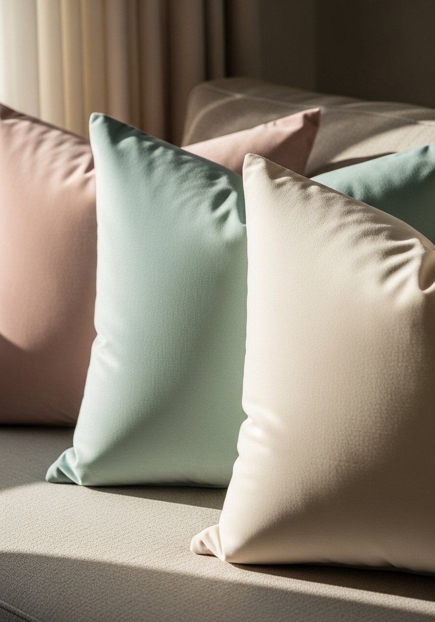
Velvet is the shortcut to polish in a pastel scheme. I use 22-inch down-filled pillow covers in two pastels and a neutral, arranged as 2:1 ratio per seat. Velvet nap shifts with light so flip the covers when they look uneven. These velvet pillow covers are washable and come in sets, which keeps cost down. A common mistake is using all the same texture. Mix in one linen or cotton to prevent a stage-set look. For high-traffic sofas pick performance velvet or slipcovers.
Pastel Ceramic Vases In Odd Numbers

Three small ceramic vases in varying heights change the rhythm of a tabletop more than a single large vase. Use a 3:2:1 height progression and pick one neutral among two pastels to keep it grounded. I keep one 8-inch, one 6-inch, and one 4-inch vase grouped on a tray. These pastel ceramic vases are cheap and flexible. People often center the trio; offset them to a corner for a casual look. Swap stems seasonally and you get a new vignette without a big spend.
Oversized Mirror With Pale Frame To Brighten Corners
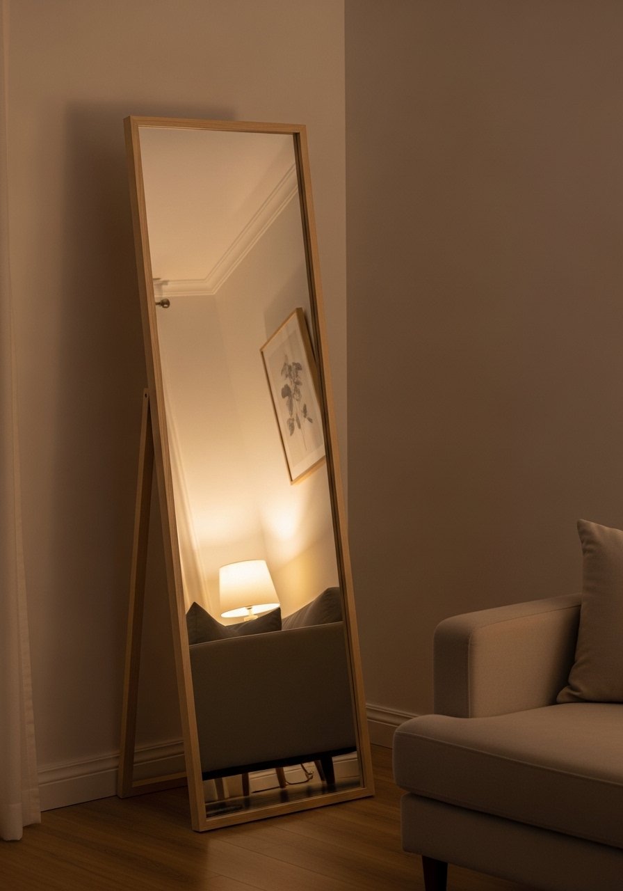
A large mirror bounces daylight and softens a pastel palette. I lean a 28×48 inch pale framed mirror at a 5 degree angle against the wall rather than hanging, which makes it easier to adjust until the reflection feels right. Choose a frame in bleached wood or matte white for consistency with pastels. This large floor mirror is great in narrow rooms where you need depth. Mistake people make is hanging the mirror too high. The reflection should include furniture feet to ground the space.
Simple Pastel Bed Nook With Layered Pillows

There is something about a reading nook with layered pillows that makes you want to cancel your plans. Start with a neutral duvet, add a pastel blanket folded at the foot, then layer two 22-inch pillows in different textures and one lumbar pillow. Use a 60/40 weight ratio: more neutral than pastel so the room reads minimalist. I use a cotton duvet and a pastel wool throw that is 50 by 70 inches. Common mistake is piling too many patterns. Keep at most one pattern and the rest solids for a calm look.
Pastel Lighting With Warm Bulbs For True Hue
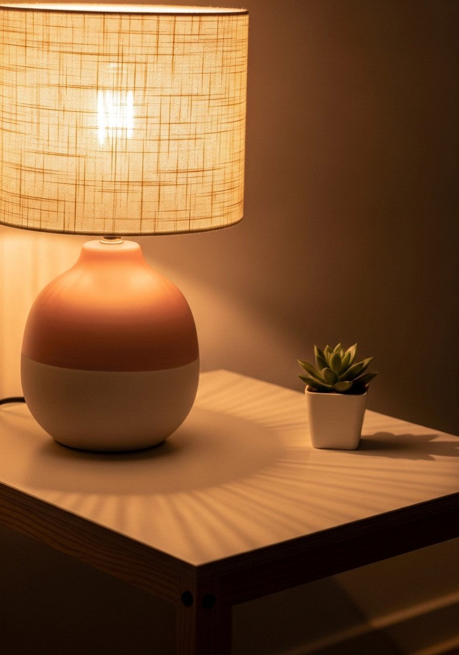
If your pastel looks cold, your bulbs are to blame. Use warm 2700K bulbs in table lamps and test the hue under both daylight and the evening lamp. Lighting shifts a pastel dramatically, so do a swatch test at night. Folks pick tough paint over exact color every time, and I treat lighting the same; I pick warmth over theoretical perfection. A pastel lamp with a soft fabric shade works better than a pastel shade on a bright LED. I swapped bulbs and a blush pillow finally read soft instead of neon.
Pastel Planters And One Tall Plant For Scale

Everyone buys five small succulents. One single 6-foot fiddle leaf fig has ten times the visual impact. Use a pastel planter for subtle color that ties to soft textiles. I use a 12-inch diameter planter for the fiddle leaf fig and smaller 6-inch planters in one complementary pastel for side tables. When you need low maintenance, pick a realistic faux at 6 feet tall. This artificial fiddle leaf fig 6ft saved me from constant watering. A mistake is scattering tiny plants; group them by scale for better balance.
Minimal Pastel Kitchen Details That Read Intentional
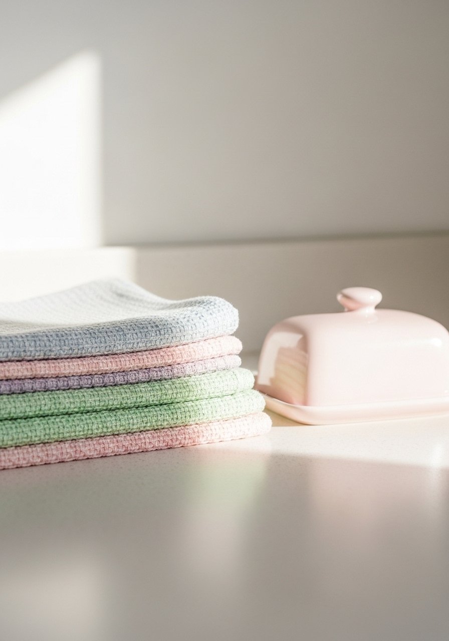
Small swaps make a pastel minimalist kitchen feel curated. Replace dish towels with two pastel linens, add a pastel butter dish on the counter, and switch out one cutting board for a pale wood board. I keep one pastel towel folded on the handle and one hanging to avoid a staged look. These pastel linen tea towels are under $20 for a set. Mistake to avoid is matching every small item to the same pastel. Use one dominant pastel and echoes only.
Durable Pastel Fabrics For Homes With Pets

Pet owners need fabrics that stand up to claws and mud while still reading soft. Look for performance linen blends and solution-dyed acrylic that mimic linen texture but wipe clean. I use 25 percent pastel accents and 75 percent stain-hiding neutrals on sofas. For washable options try slipcovers in 22-inch pillow sizes and a performance 3-seater cover. Common competitor gaps are ignoring pet durability. For high-traffic homes pick materials labeled pet-friendly and test small swatches first. A bonus is removable covers let you wash away the worst.
Your Decor Shopping List
- Honestly the best $40 I have spent. Chunky knit throw in cream 50×60 inches, knit acrylic blend
- For the curtain trick, you need length. 96-inch linen panels in dusty rose, set of two, lightweight linen. Similar at Target
- Found these while looking for something else. Brass picture ledges 36-inch, great for entryways
- 96-inch floor mirror in pale wood 28×48 inches, lean style
- Velvet pillow covers 22-inch, set of two, machine washable
- 8×10 jute area rug natural fiber base rug, durable for traffic areas
- Pastel ceramic vases set heights 4, 6, and 8 inches, matte glaze
- White oak floating shelves 24×8 inches, set of two
- Artifical fiddle leaf fig 6ft realistic texture, 12-inch planter recommended
- Pastel linen tea towels set set of three, 18×28 inches
Shopping Tips
White oak beats dark wood in 2026. Design feeds have shifted completely. These white oak floating shelves look current, not dated.
Grab velvet pillow covers for $12 each. Swap them every 3 months and the whole room feels different.
Curtains should puddle or kiss the floor, never hang halfway up. These 96-inch panels are right for standard 9-foot ceilings.
Go big with one plant instead of five small ones. This artificial fiddle leaf fig gives scale without maintenance.
Frequently Asked Questions
Q: Can pastels feel minimal instead of childish?
A: Yes. Use a 75/25 ratio of neutrals to pastel and limit pastels to accents like one pillow, one lamp, or one rug. Keep textures varied so the pastel reads layered, not theme-park.
Q: How do I test a pastel paint color so it stays right?
A: Paint a 12×12 swatch on scrap drywall and dry overnight. Most mixes flop on dry, so test small, then scale. Bring the color wheel to identify the hue and add a tiny complement to dull brightness if needed.
Q: What size rug do I actually need for layering under a coffee table?
A: Start with an anchor 8×10 jute and layer a 5×8 pastel rug centered under the coffee table. Leave 8 to 12 inches of the base rug visible on each side.
Q: Can I mix metals with pastel decor?
A: Mix them. It reads intentional. Use one dominant metal and a second accent metal. Brass picture ledges are an easy starting point.
Q: My pastel looks different at night. What do I do?
A: Swap to warm 2700K bulbs in lamps and test your swatch under both daylight and evening light. Lighting shifts most pastel shades, so judge color after dark if that is when the room is used.
Q: Are faux plants okay in a pastel minimalist scheme?
A: Both real and faux work. Faux plants give scale without upkeep. One tall artificial fiddle leaf fig can anchor a corner and keep the palette soft.
Q: How do I keep pastels looking clean with pets?
A: Pick performance fabrics and slipcovers. Use removable covers on pillows and a washable 3-seater slipcover. Test swatches first and prioritize durable fibers for seating areas.
Q: Can I match fabric to paint without it clashing?
A: Match by value and sheen. Fabrics look richer than paint at the same RGB. Bring a fabric swatch when selecting paint and test the dried paint in the room to avoid surprises.