

Spent $400 on a new coffee table. Room still looked off. Spent $35 on a throw and three candles. Suddenly everything clicked. That exact small-shift feeling is why I love gallery walls, especially traditional gold frame gallery wall arrangements. They can change the whole mood without a full reno and they work for people who like old-school polish or a slightly fussy, collected look.
These ideas lean classic-meets-transitional. Most setups run budget-friendly, under $75 per frame if you shop sales, with a few splurges around $150 for museum-style mats. They work for entryways, living rooms, hallways, and bedrooms. Pick one approach and layer in textiles, lighting, and a rug to make it feel like home.
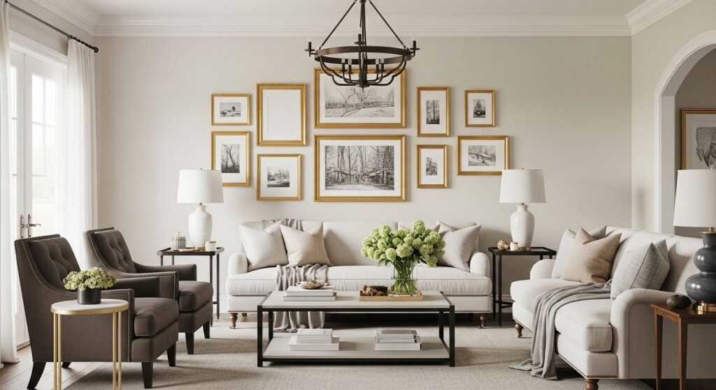
Classic Salon Cluster For A Formal Entry
I started with a cluster like this in my foyer when I wanted the house to feel older than it is. What makes it work is scale and rhythm. Use a mix of 8 by 10 and 11 by 14 frames and aim for roughly 2 to 3 inches between each frame. I like to sketch the layout on kraft paper first, trace each frame, cut and tape them to the wall, and then hang. For ease, I use a gallery-hanging-kit that holds small brass nails and picture hooks so frames sit flush. Common mistake, especially here, is hanging everything at eye height and forgetting the table beneath. The bottom row should sit about 6 to 8 inches above the console to connect the arrangement to the furniture. If you want a tiny extra flourish, swap one photo for a small vintage print in an ornate gold frame to stop things from feeling too matchy.
Matting Drama With Dark Mats For A Study
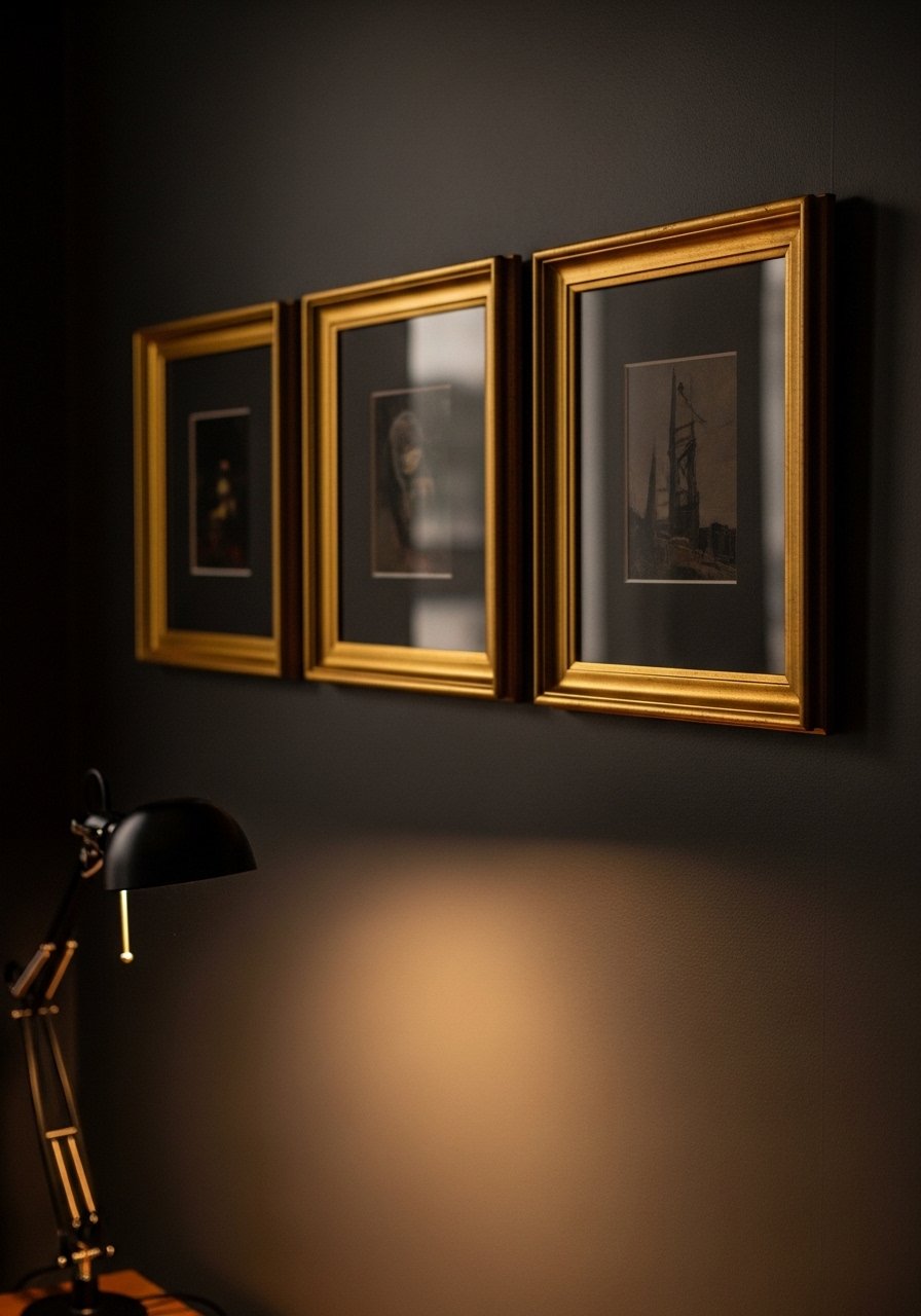
I switched to dark mats in my office to make prints feel more deliberate. A deep charcoal or navy mat gives each piece presence and helps small artwork read bigger. Use 2.5 to 3 inch mats on pieces under 11 by 14 to get that museum look. Matting is a small spend with a big payoff. I ordered acid-free mat boards and cut them to size, but if you prefer ready-made options, try a pre-cut-mat-board. The mistake I see most often is skimping on mat width. A thin mat on small art just disappears. Also test the wall color behind the mat in both day and lamp light. Over half end up repainting because home lights lie. This approach fits studies and upmarket bedrooms where you want a quiet, collected vibe.
Layered Frames On A Picture Ledge For Renters
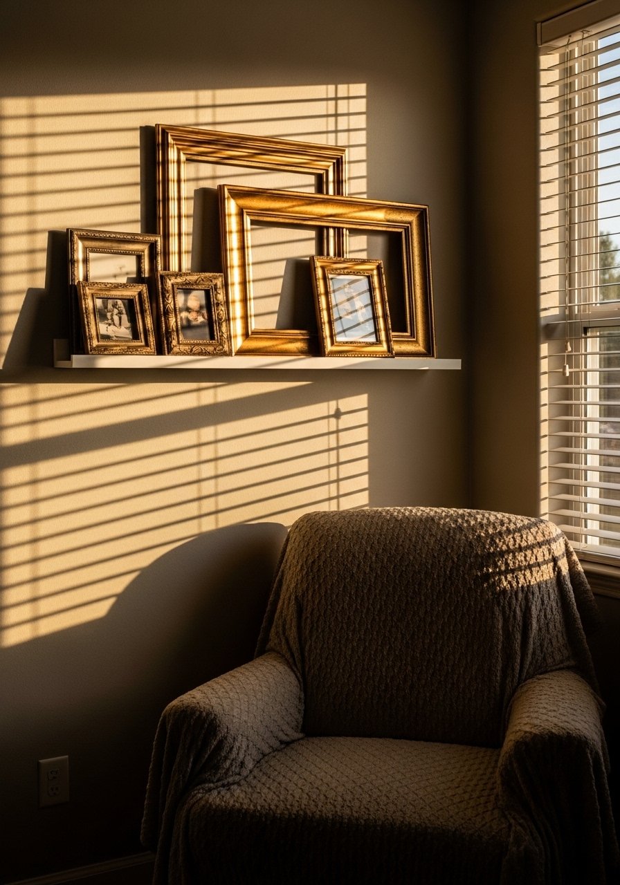
When I was renting, drilling dozens of holes felt reckless. Picture ledges changed everything. Place the largest frame slightly off-center and layer smaller ones in front, leaning them rather than hanging. That lets you swap art without fresh holes and is perfect for renters who are indecisive. I love a sturdy brass-picture-ledge about 10 to 12 inches deep so larger frames can sit comfortably. Common mistake, which I made, is overcrowding the ledge. Keep at least 3 inches between frames for breathing room. A detail most articles miss, but I learned from friends, is to include one piece with a mat even on a ledge. The mat gives depth when everything is leaning.
Symmetrical Grid For A Dining Room With High Ceilings
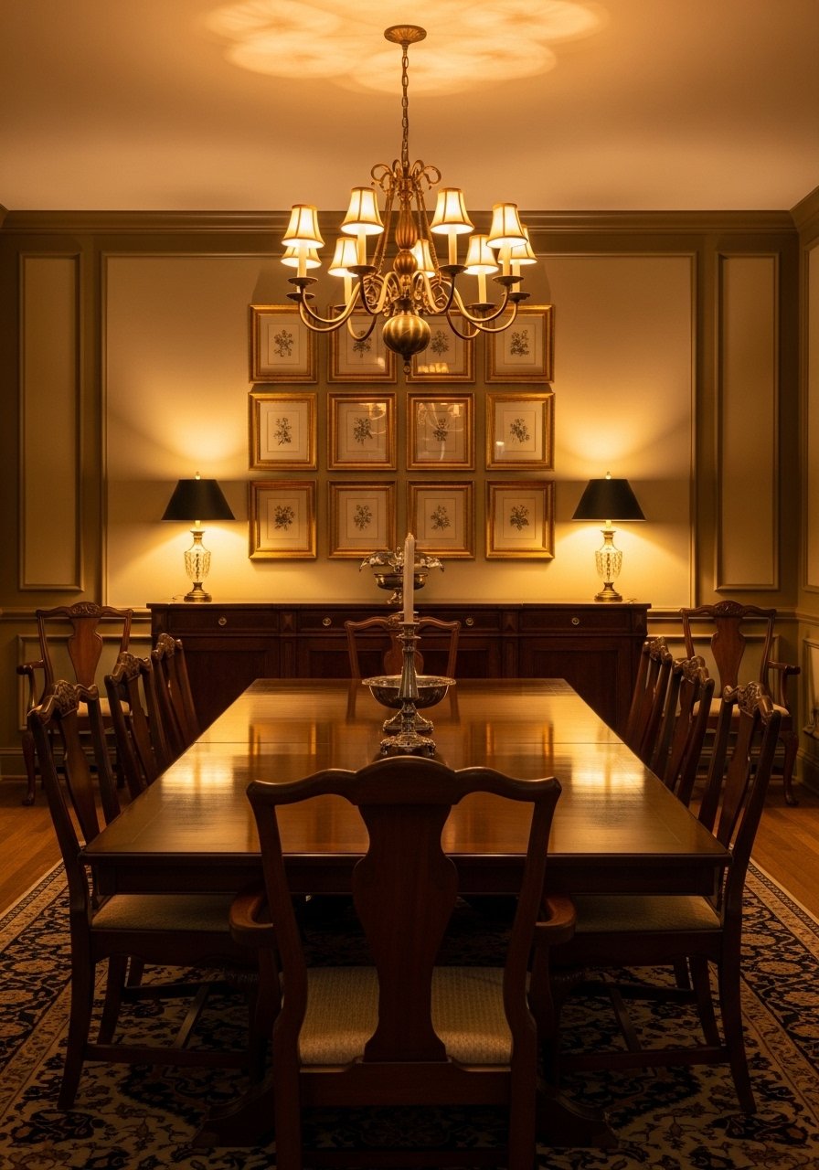
Grids are calming and feel tailored, which is why I hung a six-piece grid above my dining credenza. Measure carefully. The entire grid should be centered over the furniture and the middle of the grid should hit about 60 inches from the floor in standard rooms. For high ceilings, raise that by 4 to 6 inches so the composition reads balanced. I bought a box set of gold-picture-frames to keep the finish consistent. People often err by mixing frame sizes in a tight grid. It muddies the look. Another small trick I use is alternating two image styles, like portraits and botanical prints, to create a subtle pattern within the grid.
Mantel Anchor With One Oversized Gold Frame
There are times you want a single bold move. A large gold frame over a mantel anchors the space instantly. I recommend a frame at least 36 inches wide for a standard mantel. Leave 4 to 6 inches between the mantel shelf and the frame bottom. Buying an oversized mirror instead of art adds reflected light. I snagged a slim ornate-gold-mirror that brightened a gloomy corner. The trap is choosing art that is too busy for the frame. For a formal mantel, go simple with one strong image or a mirror. If you later want a cluster, this anchor can become the focal point around which smaller pieces orbit.
Mix Vintage Gold With Modern Frames For A Transitional Bedroom
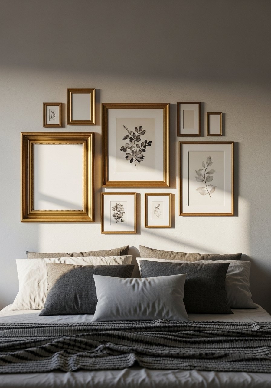
I love the tension of old and new. Mixing ornate gold with slimmer modern frames keeps a bedroom from tipping into twee. Keep the palette tight. Use gold frames for family photos and slim black frames for modern prints to avoid visual chaos. A mistake I made early on was using too many different frame widths. Limit yourself to three frame styles maximum. For easy swapping, I use interchangeable-picture-frames that open from the front. Small practical detail most posts skip, measure the bed width and make the gallery about two-thirds that width so it feels anchored but not oversized.
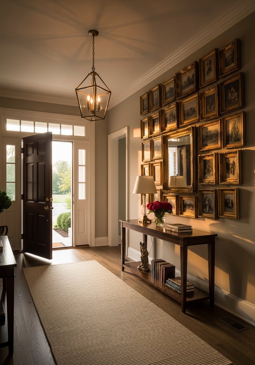
Hallway Brightening With Gold Frames And Small Mirrors
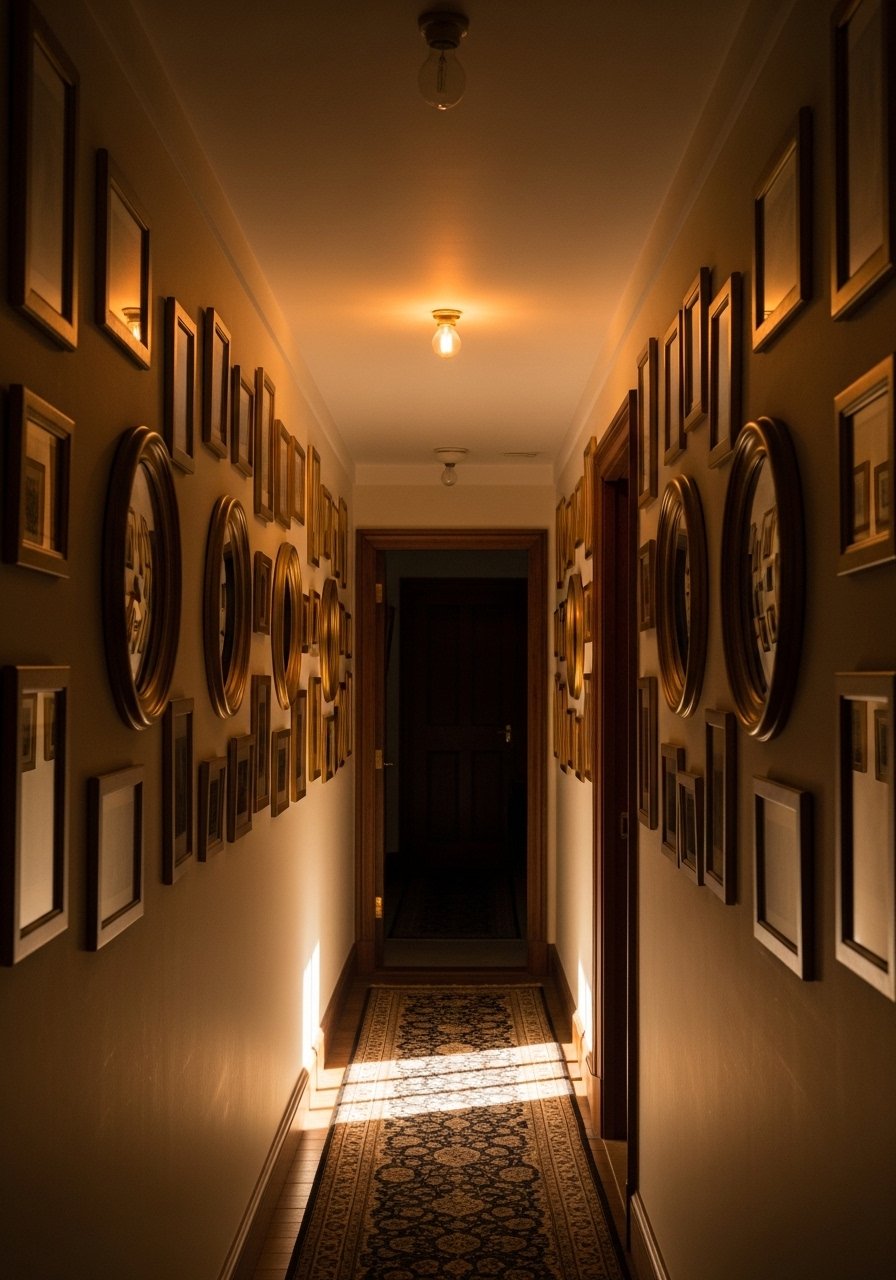
Narrow hallways always felt like missed opportunities in my old house. Adding small mirrors between frames tricks the eye into depth. Use mirrors about 12 to 16 inches wide spaced every 16 to 18 inches when alternating with art. I bought a set of small-round-mirrors that matched the frame finish. A common error is making the mirrors too large, which reduces the impact of the art. Also think about bulb color. Warm bulbs make gold frames sing, but test at different times. Scanners get you way closer than guessing by sight. That is true for paint behind frames too, so test swatches on the wall before hanging.
Rotating Kids’ Gallery With Uniform Gold Frames
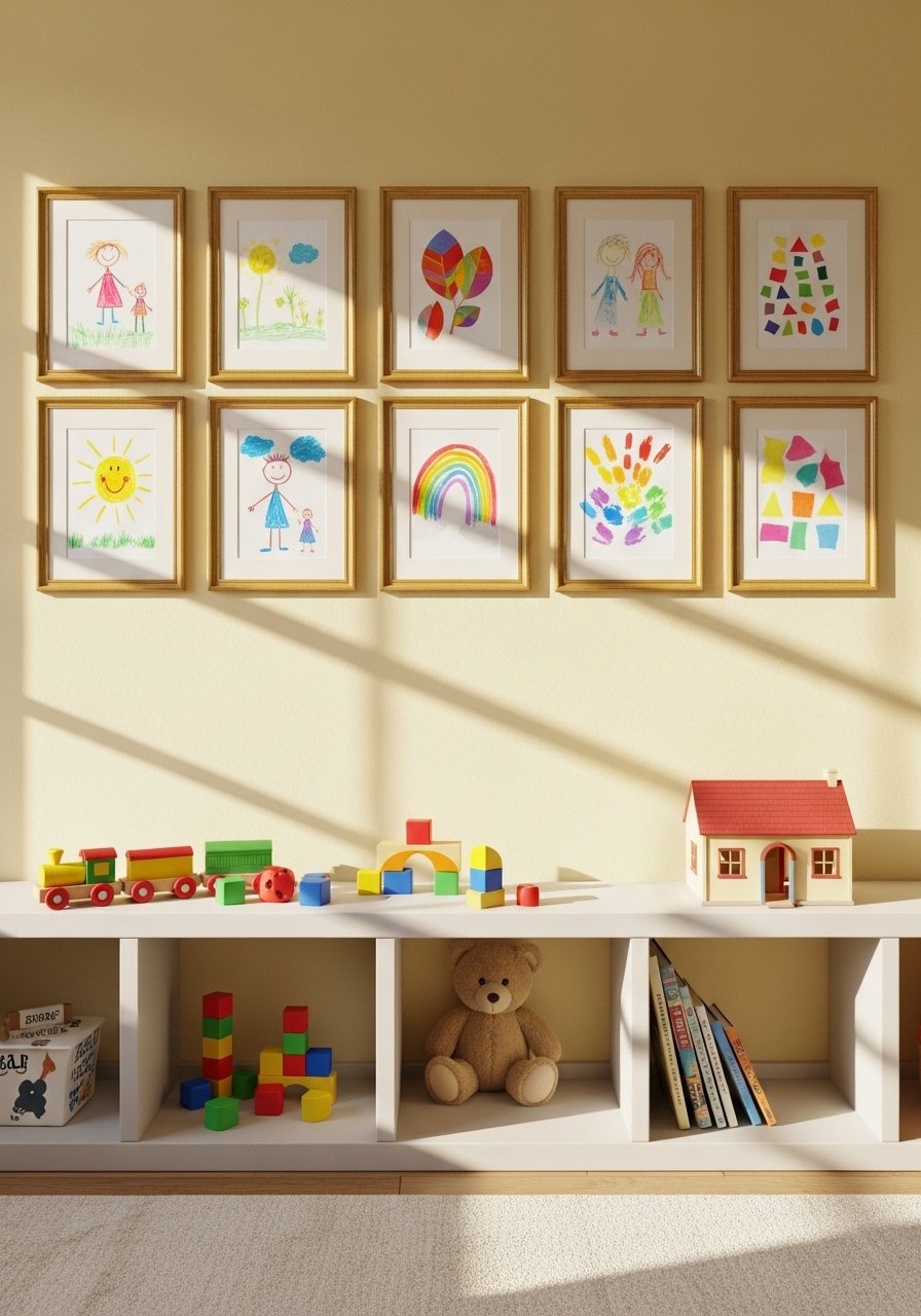
Kids produce an embarrassment of art. Instead of a chaotic gallery, I created a rotating display using identical frames. Use easy-open frames or frames with front-loading clips so swapping is fast. I use a front-loading-kids-frame and keep a small bin for new pieces. Keep the frames at child eye level and one adult-level row above for special projects. Parents often hang everything as it comes and then the wall looks like a collage of different eras. Limiting the grid to a predictable pattern and rotating monthly keeps the wall feeling curated and fun. This works in playrooms, nurseries, and casual hallways.
Gold Frames Paired With Textiles For A Sitting Area
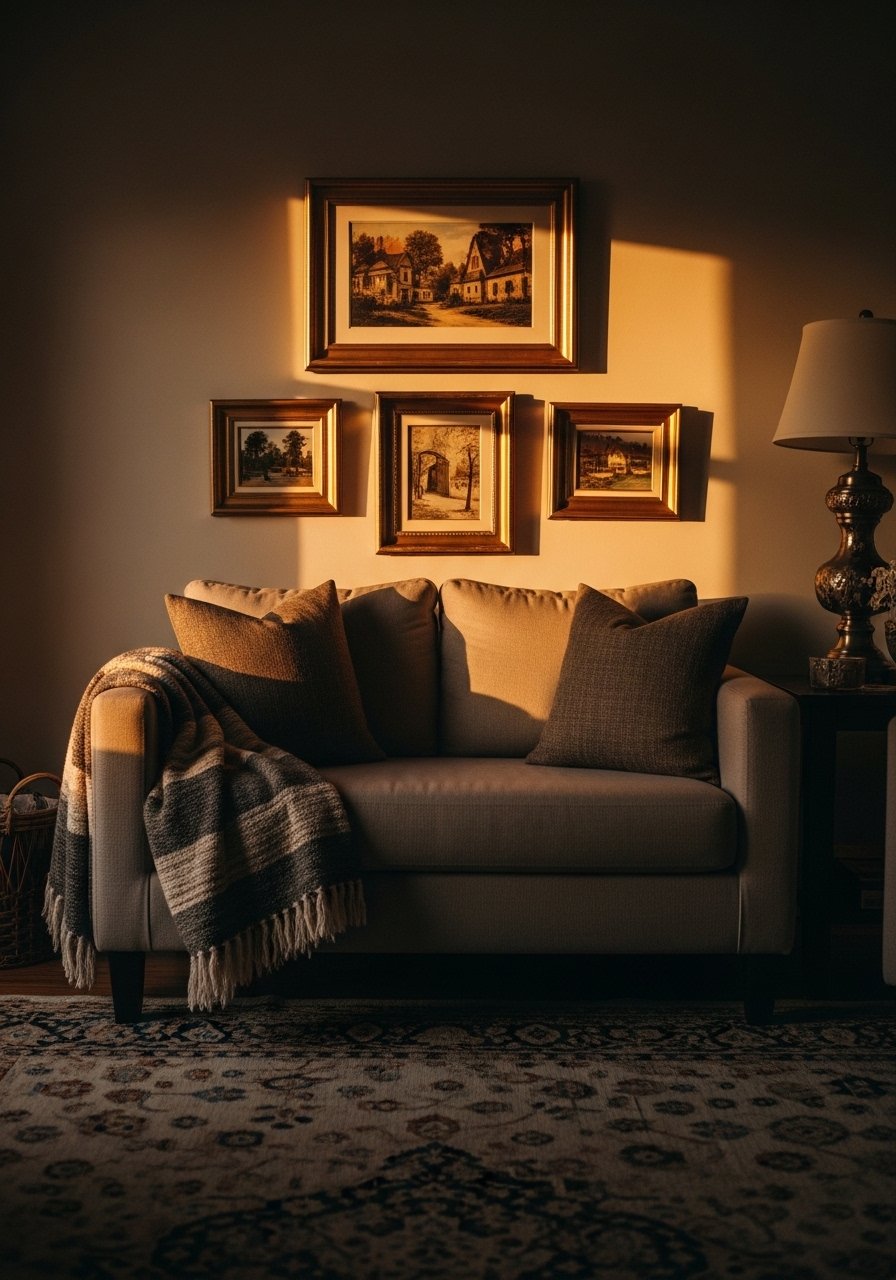
One detail that helped my awkward sitting area was matching frame tones to textiles. A warm gold plays nicely with camel throws and rust pillows. The ratio I use is 80 percent soft textiles to 20 percent hard finishes on any seating wall. That keeps things inviting. For the frames, pick one finish and echo it in a lamp base or side table. I ordered a camel-wool-throw that pulled the whole palette together. A mistake is matching the frame to every other metal in the room. Instead, repeat the gold once or twice and introduce a contrasting metal on small accents to avoid looking staged. Also, try placing one frame slightly lower than the rest to echo the height of a lamp or back of a chair.
Museum-Style Matting And Framing For A Formal Hall
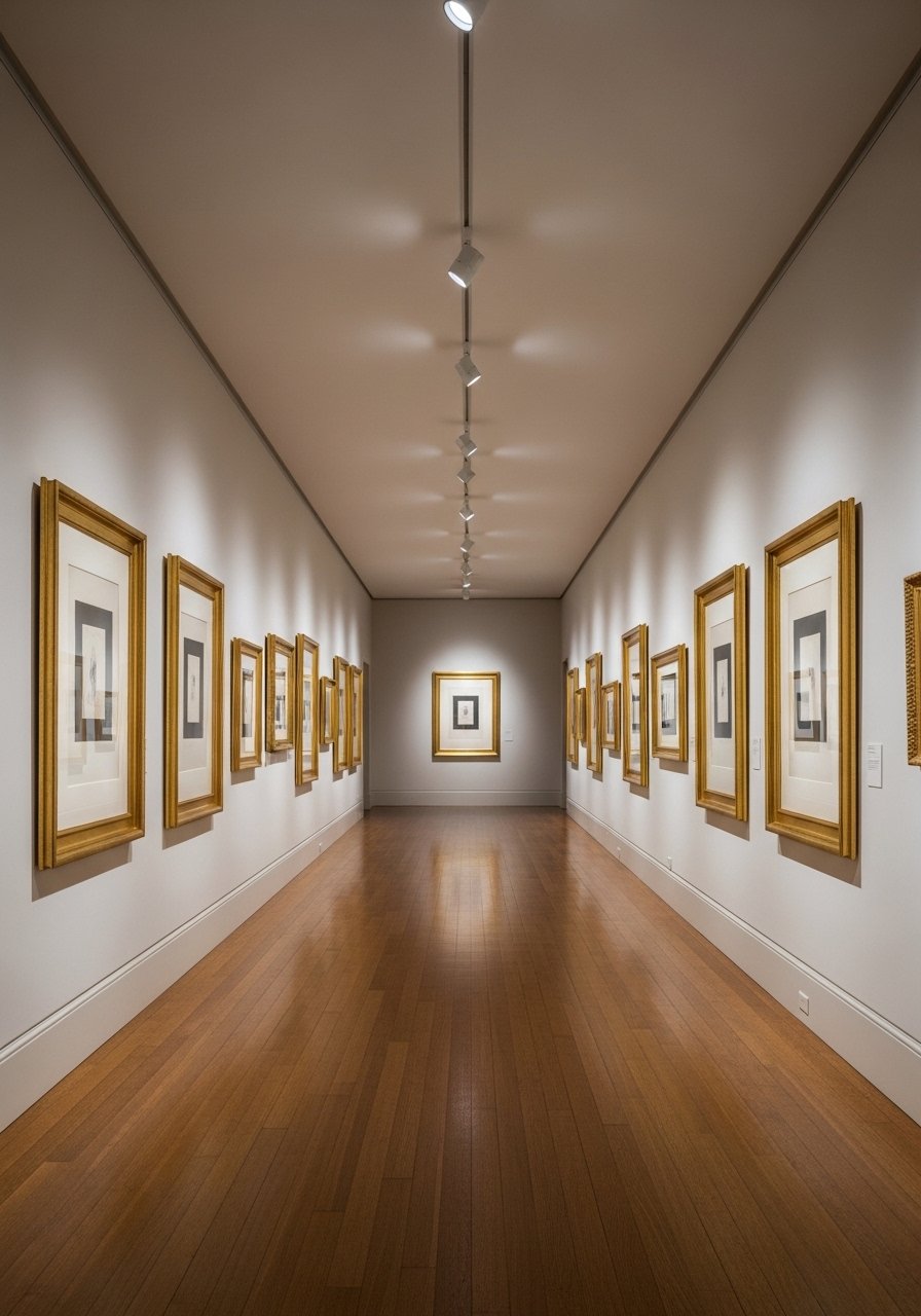
If you want a serious look, go museum route. Use 3-inch white mats, matching frames, and consistent spacing. I rehung my hall this way and the effect was calm and formal. For durability choose acid-free mats and UV-protective glass. I ordered archival supplies, including acid-free mats from a reliable seller, the archival-mat-board. A common oversight is mixing glass types. Match the glass finish across the wall or reflections will fight each other. One fresh angle most how-tos miss, I discovered, is to dry-hang for a week before final installation. Live with the layout for a few days so you notice glare spots and how light crosses frames at different times.
Your Decor Shopping List
Textiles
- Honestly the best $40 I have spent. Camel wool throw in 50×60 inches for a layered look
- 22-inch linen pillow covers down-fill compatible, set of 2, neutral tones
Wall Decor
- Found these while looking for something else. Brass picture ledges (~$18-30) let you swap art without new nail holes
- Gold picture frames set assorted sizes, practical for grids
Lighting
- Adjustable picture light in brass finish (~$25-60) for spotlighting formal pieces
Budget Finds
- Gallery hanging kit (~$12) for hooks and hangers, small buy that matters
- Small round mirrors set for hallway brightening, similar at Target
Shopping Tips
Bold tip, practical buy. Bring physical samples when choosing paint or wall color. Most folks mess up the first paint match without bringing the real chip. Paint color sampler cards are cheap and save headaches.
Grab brass picture ledges for renter-friendly swaps. They let you swap art weekly without new holes.
Curtains should kiss the floor or puddle slightly, never hang halfway up. 96-inch linen panels are the right call for standard 9-foot ceilings.
If you are unsure about mats, order a sample pack. Pre-cut mat samples let you test proportions before committing.
Frequently Asked Questions
Q: What height should I hang a gallery wall above a sofa?
A: Aim for the center of the gallery to sit about 60 inches from the floor for average ceilings. For a sofa, keep the bottom of the frames 6 to 8 inches above the sofa back so the art feels connected to the furniture. If you have higher ceilings, raise everything a touch, but keep the sofa-to-art gap consistent across the room.
Q: Can I mix gold frames with other metals?
A: Yes, mix them sparingly. Repeat gold in one or two places and introduce a different metal on a lamp or small table. Too many competing metals makes a wall look unfocused. People often try to match every metal and it ends up feeling staged.
Q: How do I avoid glare on my framed art?
A: Test in natural light and under your room bulbs. Live with a dry-hang for a few days to spot reflections. If glare is a persistent issue, choose museum glass with anti-reflective properties. Also consider moving a piece a few inches to alter the angle of incoming light.
Q: What size frames work for a salon-style cluster?
A: Mix sizes but keep a visual relationship. I usually use a core of 11×14 and 8×10 pieces with one 16×20 anchor. Leave 2 to 3 inches between frames. Trace the frames on kraft paper and tape them up first to avoid surprises.
Q: My wall looks flat even after hanging frames, what am I missing?
A: Layering matters. Add a small shelf, a lamp, or a textile that repeats a color from the art. Scanners get you way closer than guessing by sight when picking wall paint that pairs with frames, so test swatches in your space. Small shifts like a throw or a lamp change how depth reads on a wall, so try those before re-hanging.